
The best interactive infographics 2020
Natalie Ediger, November 26, 2020· Infographics

Interactive infographics: We show you the best
Infographics already got a place of honor on our blog some time ago. They are considered to be a small powertool in content marketing, because they enable a multitude of complex information to be presented in an easily understandable, clear and precise way. But now we’re going to take it a step further. Because instead of the usual infographics, in today’s blog post we bring them to life. Well, sort of. It won’t be able to speak or breathe, but it will appeal to several of the user’s senses simultaneously.
Today it’s all going to be about interactive infographics. With an interactive infographic the user is not only a passive viewer, but can interact directly with the content and get more information about a topic by clicking and scrolling. This way, even complex messages and information can be integrated into a single infographic without being perceived as too intrusive. And apart from that, interactive infographics are just so much fun!
And to make sure you get enough inspiration, I have searched for the best interactive infographics. Voilà, here comes the crème de la crème that is currently circulating online.
The best interactive infographics
“The Seas of Plastic”
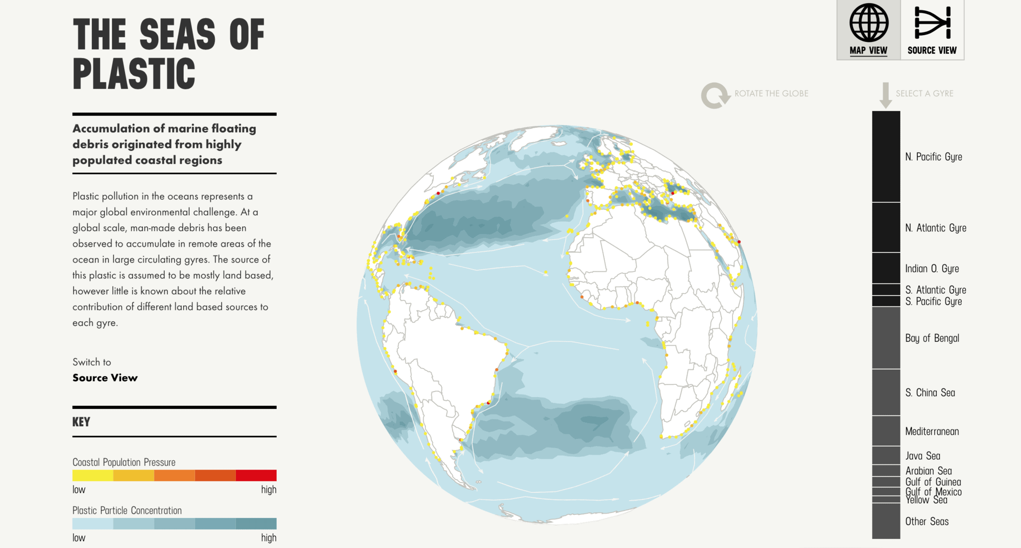
Click here for the interactive version.
The plastic pollution of our oceans is a global environmental challenge and is captured here in an interactive infographic. The user controls a 3D representation of the earth and thus sees the global ocean pollution accumulated over the last decades.
The chronology of the universe
It is not an interactive infographics in the conventional sense, but rather a video infographic. But nevertheless equally interactive. The dramatic music combined with the impressive graphics create a mysterious atmosphere and take the viewer on a breathtaking journey through the history of the universe. The ideal way to convey complex knowledge in a captivating way and to stay in the target group’s memory for a long time.
The “New New York Skyline”
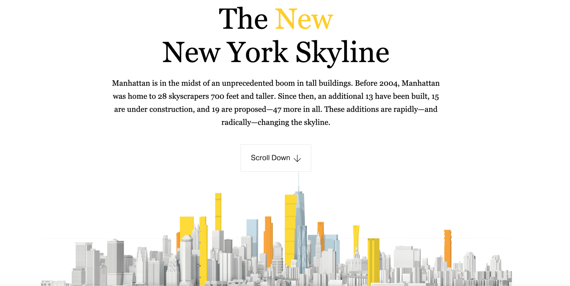
Click here for the interactive version.
Corona may have shattered your long awaited dream trip to the Big Apple. Nevertheless, you can get a little insight into New York’s skyscrapers. The magazine National Geography shows you in an interactive infographic of how the skyline has changed since 2004. Even a 3D view is possible. Pack your bags and let’s go!
“How to build a human brain” – GIF Infographic
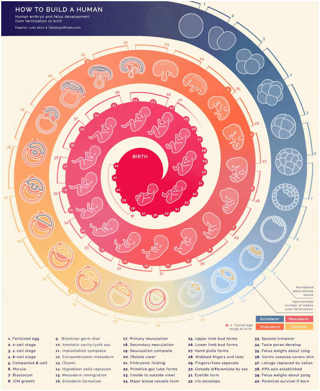
Source: spielcreative.com
We do not click on spectacular buttons or become part of an immersive experience ourselves. Nevertheless, this GIF-style infographic is very successful for learning purposes.
The graphic leads the user on a visual journey through all 40 weeks of pregancy and thus packs a variety of valuable information under one hat – without appearing overloaded. The additional animation immediately attracts attention. I wonder why such illustrations are not being used more often in classrooms. At least the students would pay more attention in biology lessons ;).
Landing page – Best Practices

Click here for the interactive version.
How to create an effective landing page? This is exactly what E-mail Monks wants to answer with this animated infographic. The viewer drives through the “Landing page Road” and reaches the destination after various stops. A colorful, inviting design adds the finishing touch. Well then, have a good ride!
Economic disparities in the USA

Click here for the interactive version.
The Economic Policy Institute, an American nonprofit organization, created this insightful graph to educate society about economic disparities and show how they can be overcome. The user can choose which economic topics he or she would like to learn more about and thus obtain specific expertise.
How speakers make sound – Animated infographic

Click here for the interactive version.
Any technology-loving musicians here? This infographics might be especially interesting for you. The GIF animation shows in detail how a loudspeaker or jukebox is constructed and how it produces sound. A perfect proof how effective an infographic can be in explaining complex technical products.
Climate change – Interactive infographic
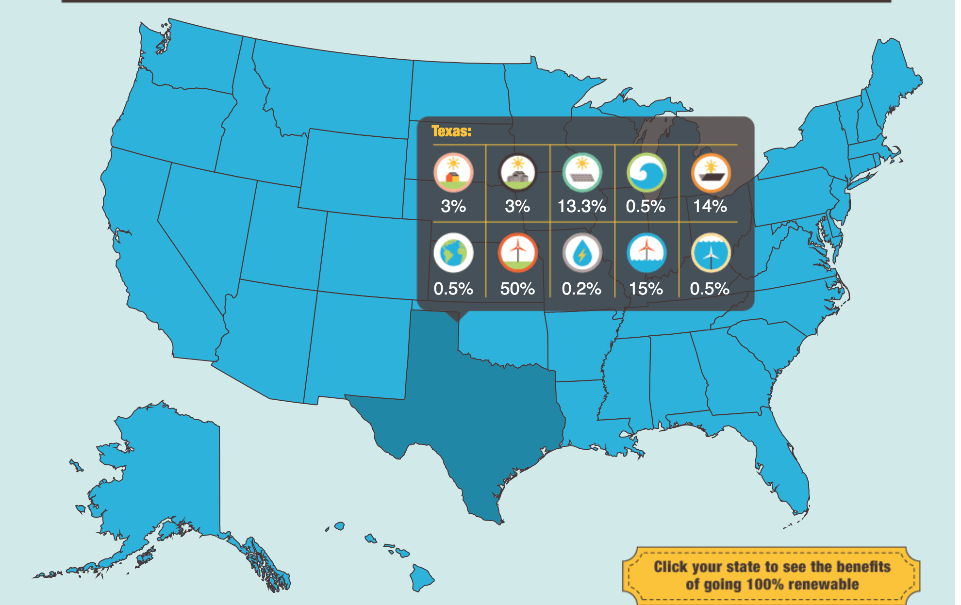
Click here for the interactive version.
Global warming is a cruel reality that we should combat as soon as possible. In this context, “The solutions project” has a very clear goal: The USA should switch completely to renewable energies by 2050. To get the project off the ground, they have created an interactive map infographic that illustrates the current state of energy consumption. The user can click on any US state to obtain detailed information. Infographics in the form of maps are generally an ideal way to communicate geographically related data in a vivid way.
Cleverclip’s Road to perfection
Eine interaktive Infografik der etwas andere Art. Malcom Gladwell behauptet in seinem Buch “Outliers-The story of success”, dass wir nach 10’000 Stunden Ausübung, Meister in einer bestimmten Aktivität werden. Meine Kollegen und Kolleginnen bei Cleverclip haben ihn sehr beim Wort genommen und darauf basierend eine “road to perfection” erstellt.
Ob Zwiebelschneiden, Schuhebinden oder Tauchen, der Nutzer kann in null Komma nichts erfahren, wie gut er in einer beliebigen Aktivität wirklich ist. Übrigens, falls es noch Spielraum nach oben gibt, geben wir natürlich auch ein paar Expertentipps. Click here to play or read the full case. oder read the full use case.
13 reasons, why your brain craves infographics
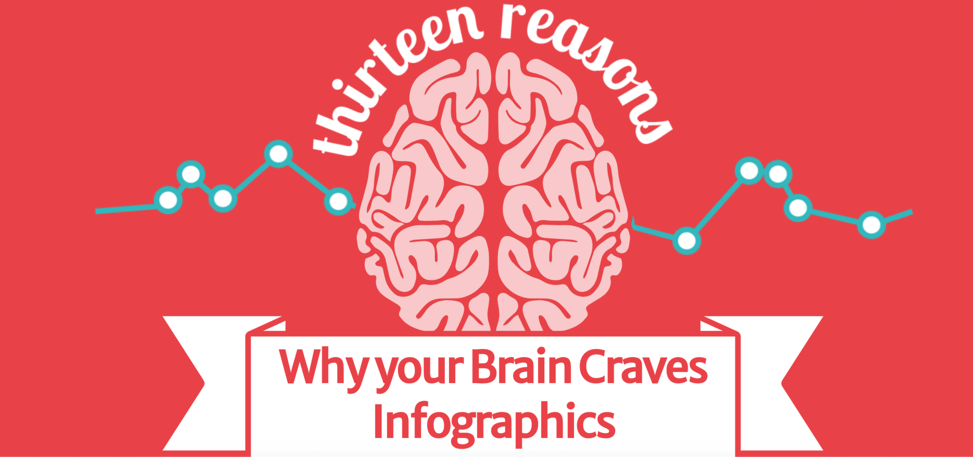
Click here for the interactive version.
Since we have been talking about infographics all this time, we should perhaps remind ourselves why they are so important. That’s what the team of NeoMam Studios thought and thus visualizes 13 reasons why our brain loves infographics. The infographic is entertaining, clearly structured and on top of that very informative. That’ exactly how it should be done!
Daily Routines of famous creative people
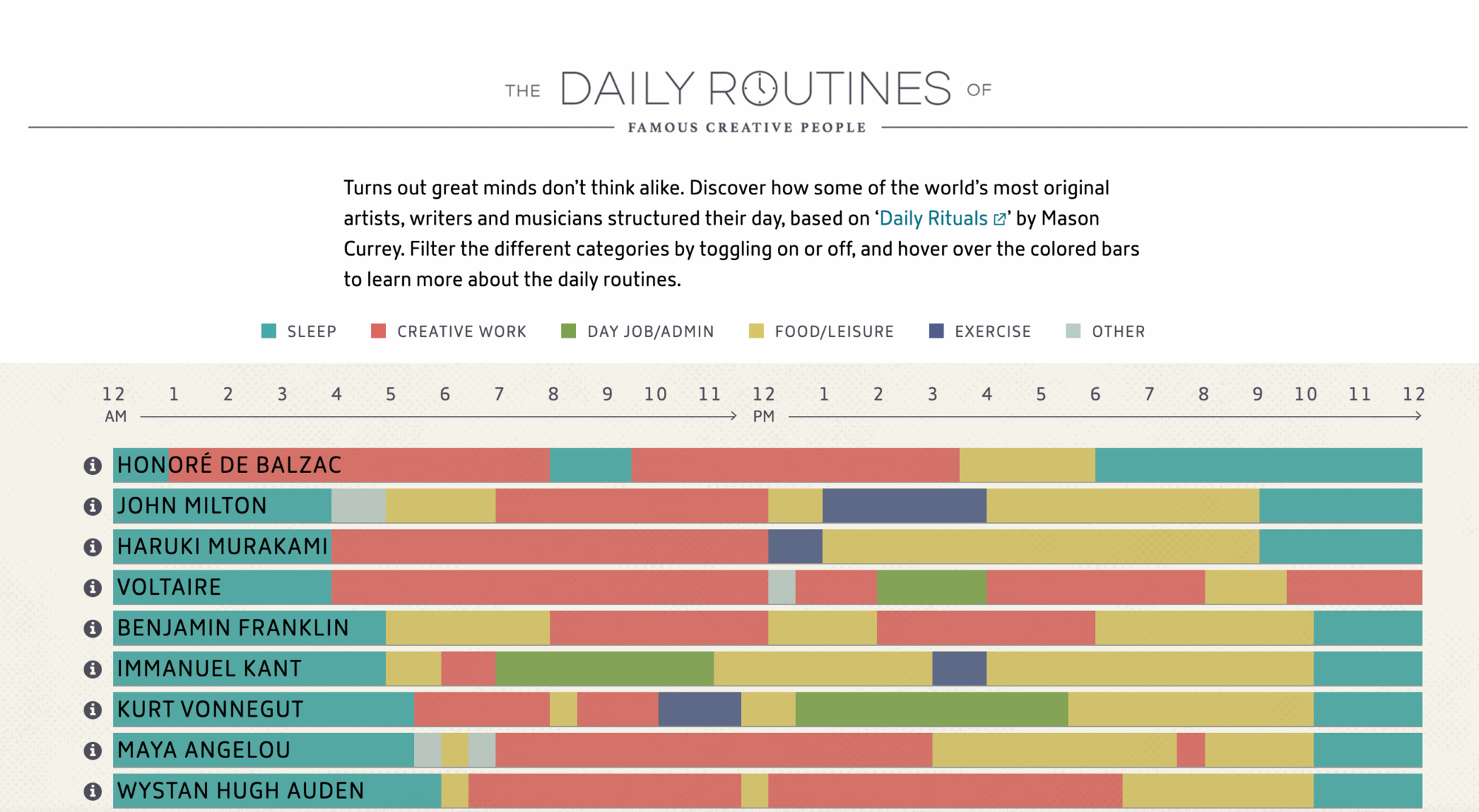
Click here for the interactive version.
How many hours a day did Mozart sleep? How many times a day did Benjamin Franklin eat? And how many hours of creative work did Picasso devote himself to? You can now find that out very easily with this interactive infographic. Based on “Daily Rituals” by Mason Currey, you can filter by different categories and then move the mouse pointer over the bars to get more information.
WiHow family incomes affect children’s college chances
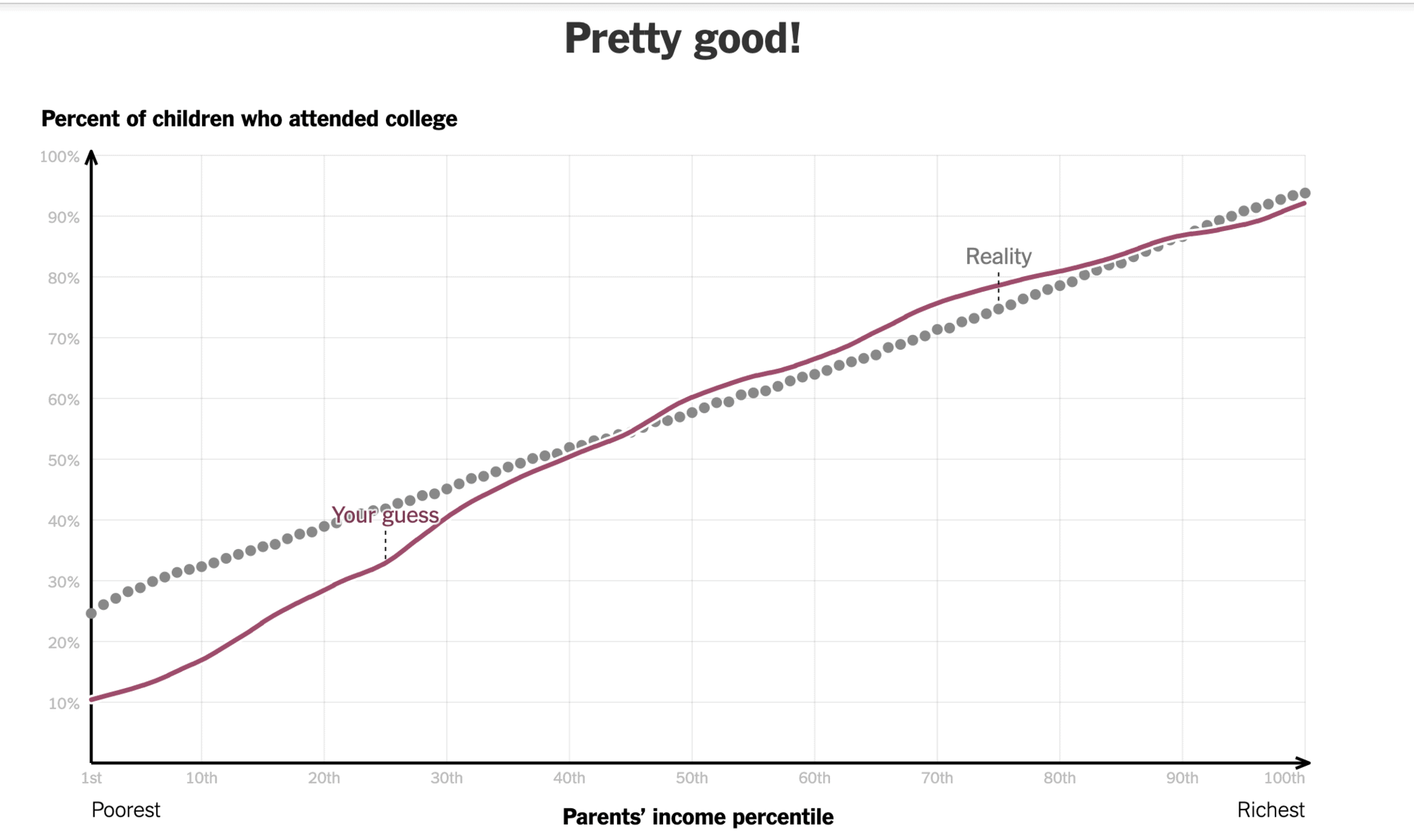
Click here for the interactive version.
It is not quite a classic infographic, but it is still a very interesting and interactive method of conveying facts by means of storytelling. Here you can first draw your estimate, compare it and receive additional information.
How far is the mars?
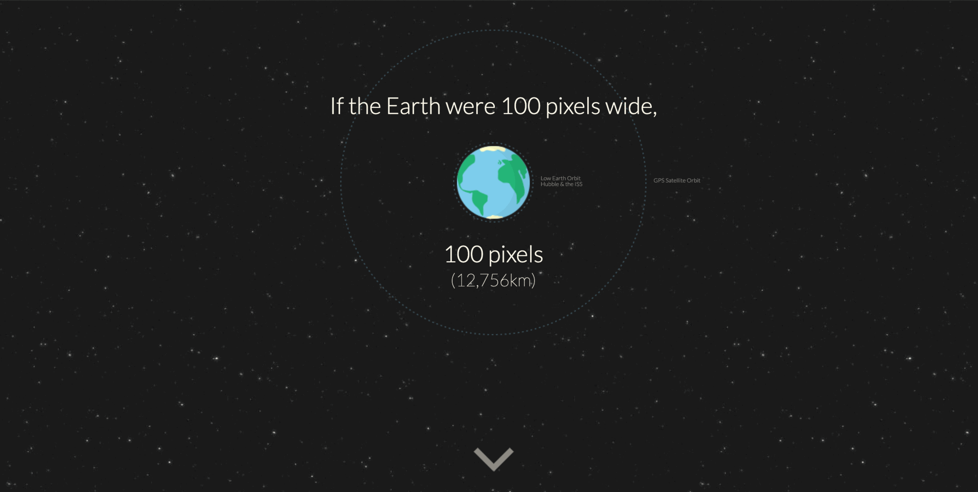
Click here for the interactive version.
An impressive way to show the user how far away Mars is from Earth. With additional information displayed, the entire journey through space becomes an entertaining adventure.
The path of social change
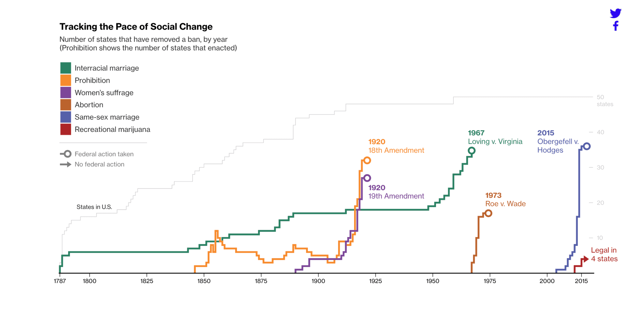
Click here for the interactive version
An exciting interactive infographic illustrating the social changes in the USA. Six major topics are being analyzed: Mixed marriages, prohibition, women’s voting rights, abortion, same-sex marriage and the legalization of marijuana. By clicking on the respective states, the user can find out how these areas have developed or could change in the future.
The refugee flow to Europe
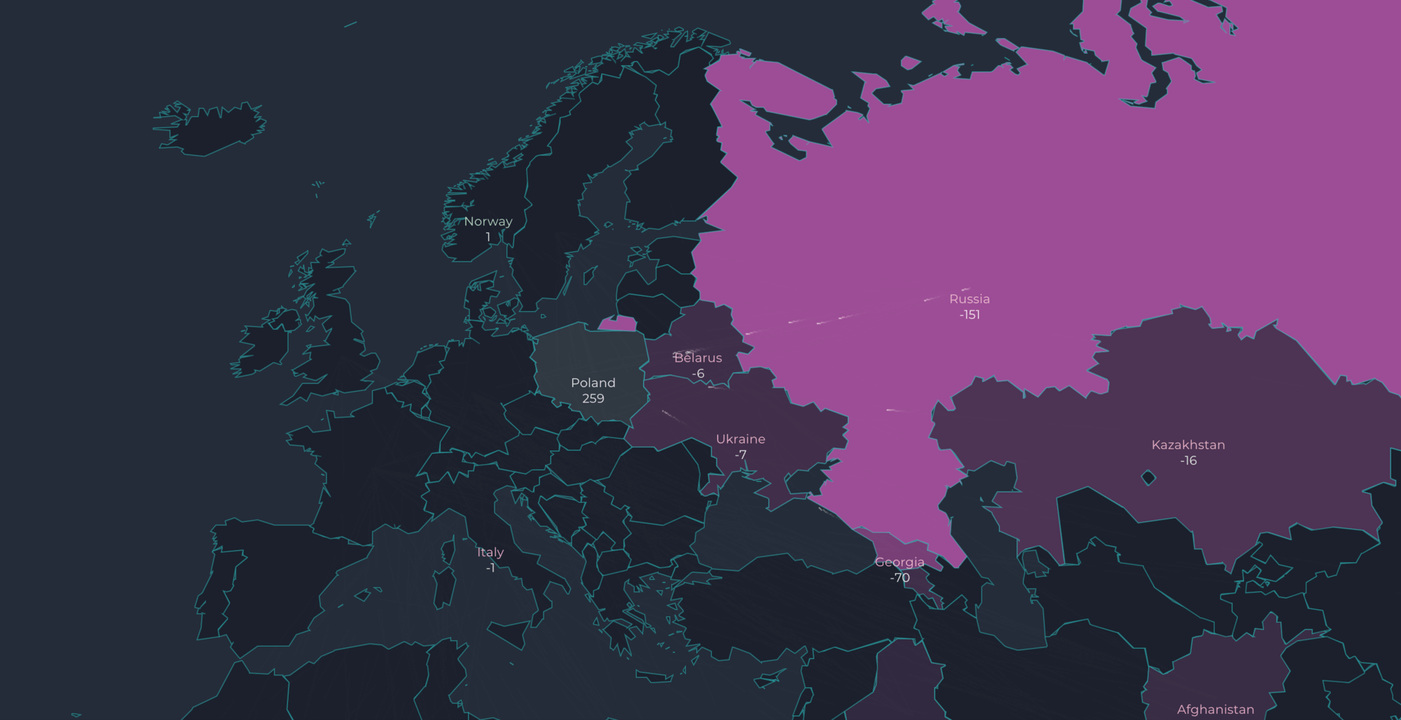
Click here for the interactive version.
Also no longer quite up to date, but still very informative. Here the refugee movement since 2012 in Europe is being shown. Each point is representative for about 25 people. The user can move the mouse pointer over the individual countries to obtain further details. On a timeline, the exact year and month can also be set.
How to create such a breathtaking interactive infographic
Now that you are (hopefully) inspired enough to get down to business, you might ask yourself the question of all questions: “How do I actually create interactive infographics?
As you may have seen in the examples, most infographics become “interactive” by giving the user additional information as they scroll and click. So before you start creating your interactive infographic, you should think carefully about what information should be interactive and which elements (e.g. links or buttons) should be used.
Interactive infographics are usually implemented with HTML5, Javascript and JQuery. In principle, a static HTML page with integrated scripts is created first, which then enable the dynamics. For the creative design of an infographics there are also a variety of online tools. Here is a selection of particularly popular programs:
Kartograph (für interaktive Karten)
Important steps when creating interactive infographics
Regardless of whether the infographics are interactive or static, some general factors should always be considered:
1. Target and target group analysis
What information should be illustrated? Define the goal at the beginning and analyze your audience in detail. Finally, the infographics should be in line with the needs of the target group and the brand message, both in terms of design and content.
2. Key message and added value
The infographics should convey a key message as well as the most important points that the audience can comprehend within a short time. Also make sure that the infographics provide the audience with a decisive added value.
3. Catchy headlines
Short but expressive headlines suggest exciting content even at first glance. Make sure that the headlines are relevant to the content of the infographic but also catch the viewer’s curiosity.
4. Visually appealing
Effective infographics are characterized by a good balance between graphics and negative space. Without sufficient negative space, every infographic quickly becomes overwhelming. The color scheme also plays a role: In general, the rule of thumb is to limit yourself to a maximum of three colors from the color palette, with the lightest color marking the background and the two darker, different elements.
5. Avoid too much branding
All brand-specific content can very quickly be perceived as obtrusive sales and invalidate the narrative magic of infographics.
Besides the independent creation with the help of online tools, the cooperation with a professional agency is of course also an option. This is especially useful if the topic is complex and contains a lot of information and facts. Despite higher costs, an agency knows exactly how the information should be presented in order to provide the audience with a decisive added value. The creative team helps you to professionally integrate interactive elements and thus create a breathtaking user experience with an appealing design. A good agency will also always try to find a good price-performance ratio for different budgets.
At Cleverclip, for example, we work together with the client to find the ideal approach for the implementation. Our projects usually start with a creative workshop, where we gather all the necessary information regarding the topic and target group and answer any questions that arise. According to the customer feedback, we develop a suitable style that perfectly conveys the information to the target group.
Conclusion
I really hope you enjoyed this little visual journey into the land of data visualization. An interactive infographic can definitely enrich your marketing strategy. They pack complex information into an exciting story and motivate the viewer to actively participate. Through interactive elements, they can also accommodate more information than static infographics. Have you come across exciting interactive infographics that are missing in this article? Then let us know. By the way, I have been looking for a lot of “best ofs” lately. Check out the best explainer videos 2020 or dive into an exciting landing page journey.