
Infographic Tips for effective content marketing
Natalie Ediger, June 10, 2020· Infographics

I would like to dedicate today’s blog post to a very special all-rounder in content marketing. An all-rounder that has the ability to present complex issues visually and understandably and can even go viral when used correctly. I am referring to the “infographic”. And since infographics have established themselves as such an enormously powerful means of communication, we want to talk about some infographics tips in this blogpost to help you spice up your content marketing efforts.
What is an infographic?
An infographic allows to present a variety of complex information in an easily digestible, clear and precise way. The main objective of an infographic is to convey knowledge quickly and in an entertaining way. Sounds like another of those content formats that marketing specialists have established to finally create a new hype. However, infographics do offer a lot of potential and are enormously effective in all kinds of areas and industries. Take a look at the following example and consider the effect it would have if you were looking at the same information exclusively in text form:
Quelle: Cleverclip
I think we can agree that the same information would not be half as effective without visual design.
An infographic is particularly powerful because it combines graphics, colours and valuable information and divides them into manageable individual areas. Key information can thus be exploited after only a brief glance.
Why use infographics?
Think about how much content you have encountered today. On the smartphone, on television, in a magazine, on posters. Advertising, advertising, advertising. Content, content, content. Given the sensory overloard and decreasing attention spans to 8 sec, visual content receives much stronger response from viewers than pure text.
This is no big surprise, since 50% of our brain is involved in the processing of visual content, with 70% of the sensory receptors located in the eye. For this reason, we can not only process visual content faster, but also store it better in long-term memory. And because infographics present informative text in the form of visually appealing graphics, they have become such a powerful marketing tool. According to Hubspot, infographics on social media are actually shared three times more often than traditional content.
In summary, infographics offer the following advantages:
stronger brand awareness through appealing visualization combined with specialist information
more memorable and effective communication of complex information in an entertaining way
better storage in the consumer’s long term memory through a visual presentation
stronger “sharing and resharing” on social media and thus the possibility of going viral. This results in more traffic and reach, as well as a higher SEO ranking. Ergo, again more brand awareness.
Proof of entrepreneurial expertise through the consolidation of large, complex data volumes
Infographic tips for more response
To deliver the desired benefits, the infographics must also be designed appropriated . In the following, you will learn which elements make an effective infographics stand out:
Target group oriented
When you create an infographic, it must of course be adapted to the needs and interests of the target group, both in terms of design and content. Therefore, analyze your audience and consider which content and which design is best suited to your needs.
Storytelling
An infographic is anything but an arbitrary combination of dry facts. The audience should be informed in an unusual and entertaining way. Effective infographics should therefore tell a story with a closed plot framework and thus take the audience on a visual journey through the graphic elements. With good storytelling we attract the attention of the target group, create a higher engagement and can therefore place our message more effectively in the consumer’s mind
Added value
Why exactly should anyone be interested in infographics at all? Of course an appealing design can be relevant for the first impression. But if the reader notices that the infographics do not provide him with any new information, the interest is quickly gone. So before you create an infographic, ask yourself first of all, what benefit the audience will get from it. Will they be informed? Does it get new insights? Infographics have the goal of presenting complex messages in an easily understandable way and should therefore provide the viewer with a decisive added value.
Central core message
Many infographics try to compress different information into one representation without concentrating on the essential. However, this makes the infographics lose their main purpose and the audience can no longer follow the content clearly. Therefore you should avoid a motley combination of facts from all possible directions. The infographics should convey a central core message as well as only the most important points that the audience can understand in a short time.
Meaningful headings
Effective infographics should attract the attention of the audience within the shortest possible time. This is achieved primarily through short but expressive headlines that suggest exciting content at first glance. Make sure that the headlines are relevant to the content of the infographics but also “catchy” enough to arouse the curiosity of the target group.
Visually appealing
Avoid too much text on an information graphic. This makes it look chaotic and well… not very inviting. With a good infographic, text and graphic elements should be in harmony and emphasized by a clean and harmonious design. An effective infographics is characterized above all by a good balance between graphics and negative space. Without sufficient negative space, any infographic will quickly become overwhelming and deter the viewer.
The color scheme also plays a role: In general, the rule of thumb is to limit yourself to a maximum of three colors from the color palette, with the lightest color forming the background and the two darker ones forming different elements. Also avoid squiggly fonts and make sure that every font is easy to read.
Precise research
The aim of the infographics is to provide the viewer with valuable information. If the data does not originate from your own sources, make sure beforehand that the sources are of high quality and serious and, yes, that they are not “fake news”. If you provide false information and do not use trustworthy sources, you are putting your own credibility into question. By the way, the source should not only be mentioned in the doctoral thesis. Even in an infographic you are not exempt from this obligation 😉
Interactive elements
Interactive contents are generally always power tools in the content marketing area and provide a real engagement boost. However, you should first analyze carefully whether the embedding of interactive elements in your content is really relevant. If you need to communicate a variety of topics or work with particularly complex content, an interactive infographic can be useful to avoid being perceived by the audience as overwhelming.
Avoid too much branding
Of course, the infographics should be characteristic for your brand and even carry a small logo to be better recognizable. Finally, it is also important that the audience associates the infographics and expertise with your company. But don’t overdo it with branding: all brand-specific content can very quickly be perceived as intrusive sales and invalidate the narrative magic of the infographics.
Optimize distribution
A point that is unfortunately often not taken into account. Even if your infographic are entertaining and informative at the same time with the most appealing design, you won’t achieve the desired success if nobody sees it. “Somehow it will go viral”… . Of course I wish you the best of luck, but generally marketing is not inexplicable magic, but a good strategy.
Therefore, optimize the infographics with special SEO keywords, the right alt texts, images and backlinks so that they get a higher ranking in the search engine and can also be found by the viewers.
You should also become active yourself! Share the infographics on relevant social media channels other relevant blogs for possible backlinks, cooperate with bloggers who can support you in distribution. And very important: Don’t forget the entire internal team. Every employee can share the content in his or her own network and thus achieve a higher reach.
Types of infographics and examples
Infographics allow complex information to be shared with an audience in an exciting way. Depending on the amount of information, topic, target group and other individual factors, you have a variety of options to create an exciting infographic. To give you a little inspiration, we present some common formats:
Statistics
This classic wraps analytical results into a story. They can be presented in the form of pie charts, pictograms, etc. These infographics are particularly suitable for a vivid representation of sales, turnover, market analyses, studies or surveys.
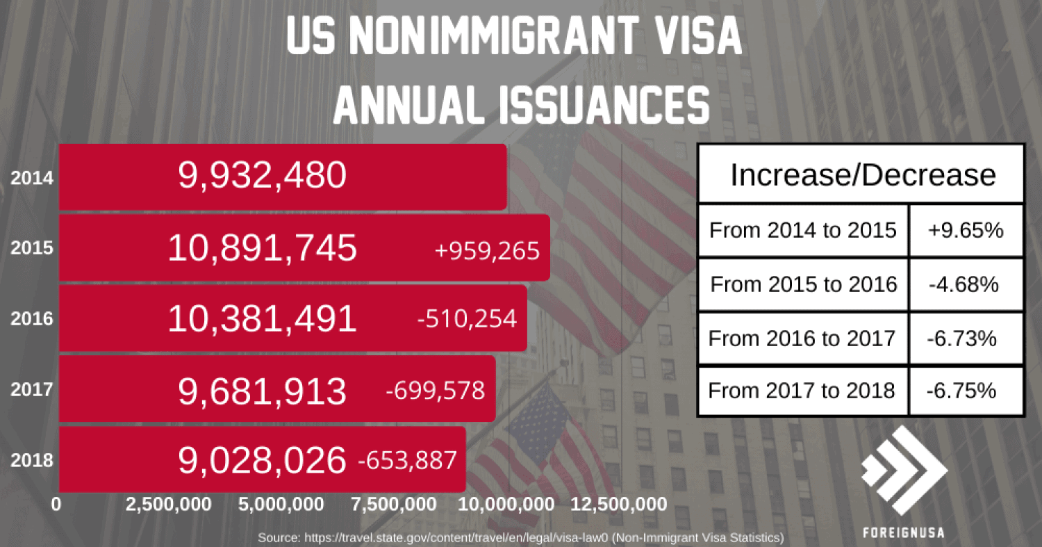
Quelle: Visual.ly
Maps
As the name suggests, (land) maps are used here as the dominant visual element. These infographics allow you to present population and location-related data and to structure the population according to demographic criteria in order to illustrate a specific topic.
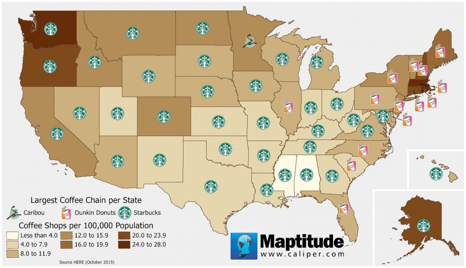
Quelle: Visual.ly
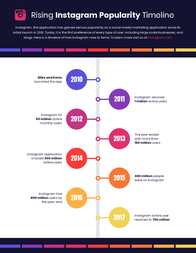
Timelines and chronology
A timeline with specific dates and information allows chronological achievements and events to be clearly displayed. With the help of graphic elements, individual points in time can be better emphasized. A great visualization option e.g. for the company history and its special milestones.
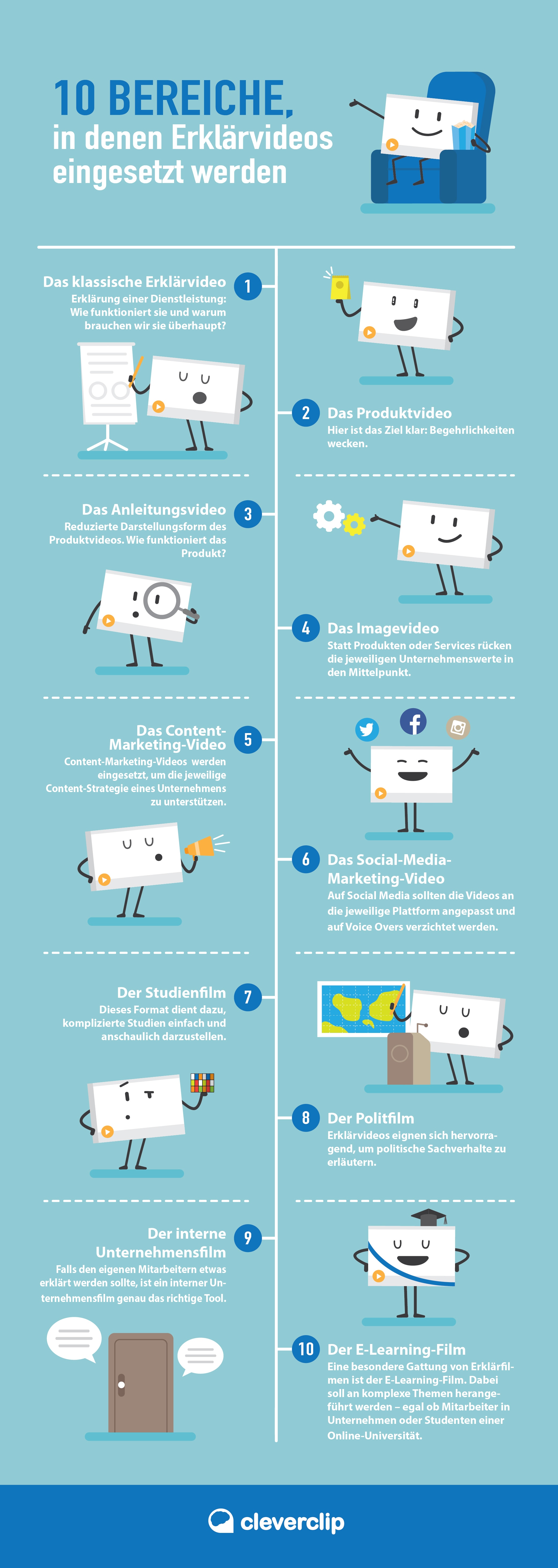
Enumerations or lists
If you need to create a list, but want to make the content more appealing than an ordinary list with boring bullet points, this is the right format for you. For example, you can replace the headings with symbols or insert a simple illustration for each item.
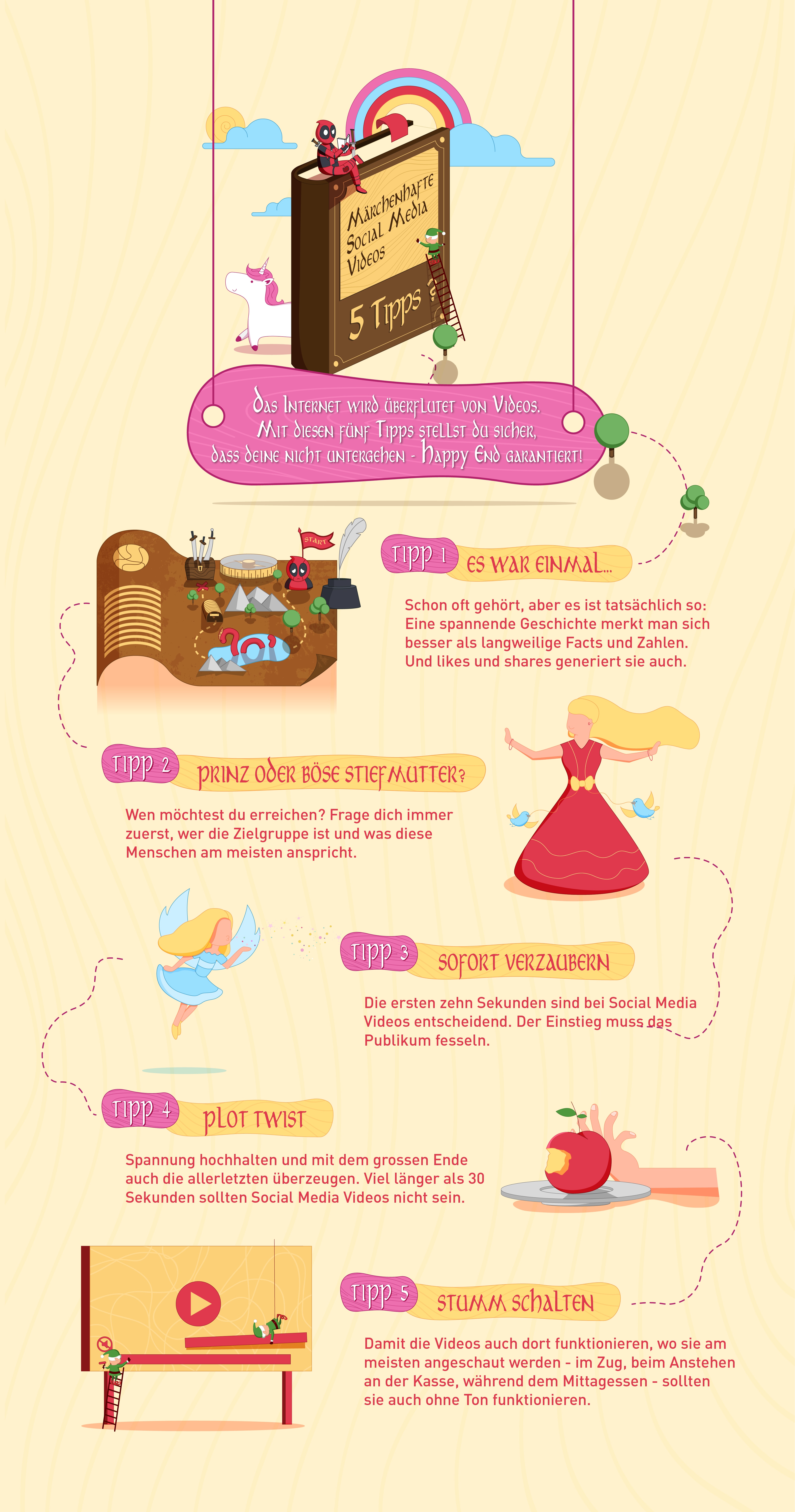
Quelle: Cleverclip
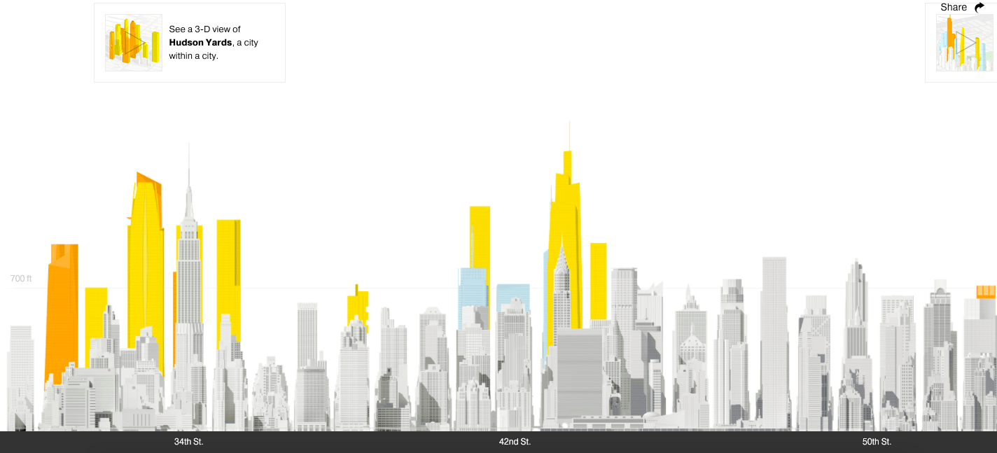
Interactive infographics
Interactive infographics can be designed differently. Often these are diagrams with integrated elements that convey further information with the help of a mouseover. As mentioned earlier in the article, interactive infographics are particularly suitable for a variety of more complex topics in order to appear less overwhelming at first glance. Through interactive elements you achieve a much higher engagement of the target audience
In the following example an interactive infographic from National Geographic shows how the skyscrapers in NYC have developed over time.
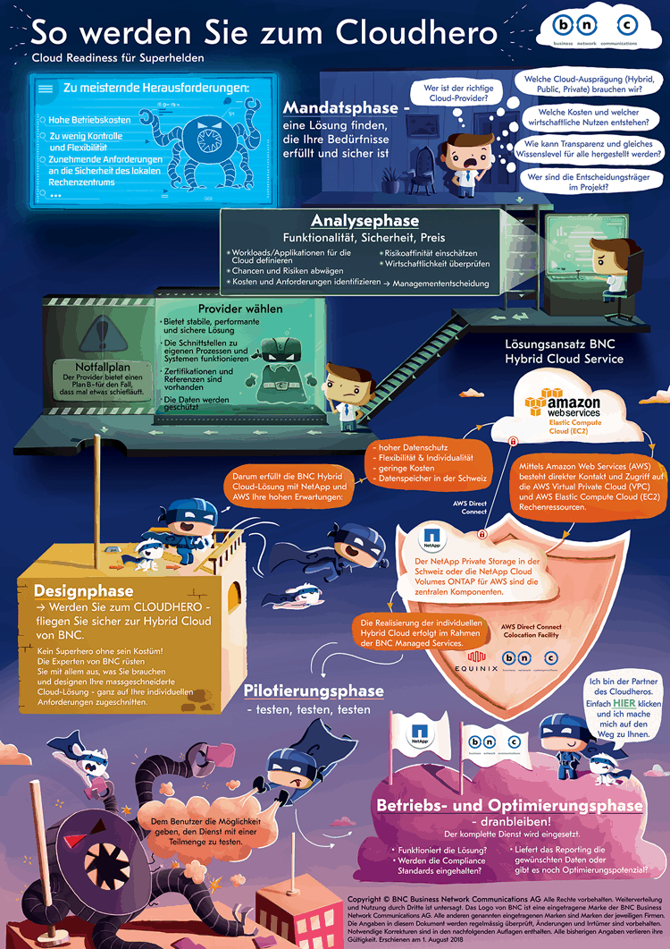
Processes
Usually it is a clear layout with a series of steps and special illustrations to illustrate these steps of a particular process. Suitable areas would be manufacturing processes, supply chains, recipes, etc.
.
Quelle: Cleverclip
Hierarchies
This format allows you to display the information in specific layers, typically in the form of a pyramid or a flowchart.
Quelle: Venngage.com
Comparisons
Infographics in the form of comparisons are particularly powerful because they arouse curiosity through the contrast. In this case, tables are suitable which show the main differences or advantages and disadvantages of a certain topic. If you want to make an option more desirable, play with colours to make one option more appealing than the other.
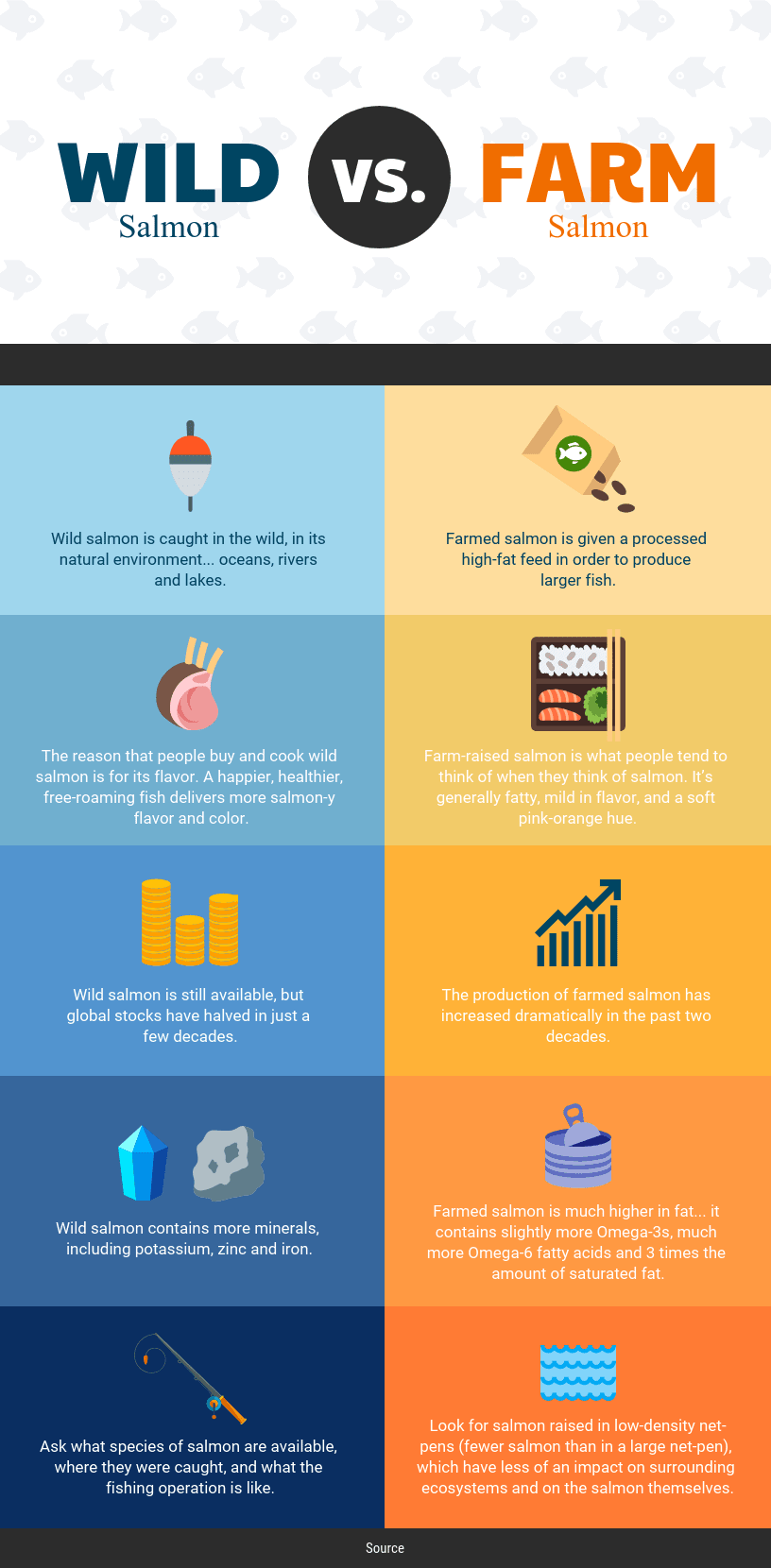
Quelle: Venngage.com
Our conclusion
As you can see, there are many formats and different areas of application for an infographic. Infographics make it possible to wrap your information into a visual story in such a way that the viewer can build a much stronger emotional bond with the content.
Look for a creative but clean design, a core message with added value, package your data into a vivid story and share your end result with the audience. Sounds too complicated? Then feel free to contact us – we will support you in creating a memorable infographic 😉