
The best landing page examples
Natalie Ediger, August 26, 2020· Communication
In my last post I have explained which elements should not be missing in an effective landing page. In addition to the clearly recognizable CTA, the product benefits, the “above the fold” rule, testimonials and a form, the landing page should also convince with a minimalist but attractive design. But what exactly does that mean in practice? Buckle up and hold on, I have worked my way through the World Wide Web to discover some successful landing page examples for you. I came across the following results:
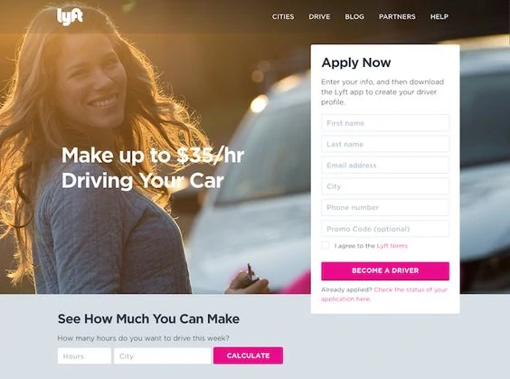
Who among us would not like to earn enough money, and preferably quickly and easily? That’s probably what Lyft thought when they created the main message of the landing page for the headline: Earn $35 an hour. At the same time, the hourly salary can be calculated specifically for the city. Besides that, the page is kept simple with a form that asks for the most necessary information only. The only disadvantage of the landing page: The extra buttons on the top might distract viewers from its purpose.
Source:Hubspot
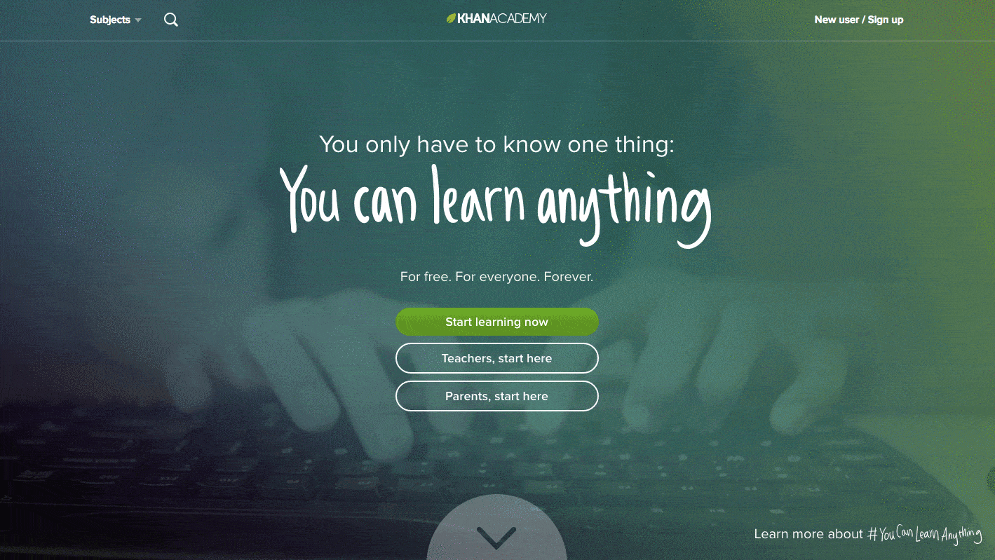
This landing page succeeds in addressing three target groups at once: students, teachers and parents – without neglecting the goal or even appearing confusing. The main message “You can learn anything” also has an inspiring and motivating effect. Overall, the landing page is very clearly and elegantly designed, does not distract with unnecessary buttons and conveys exactly the message needed.
Source: Hubspot
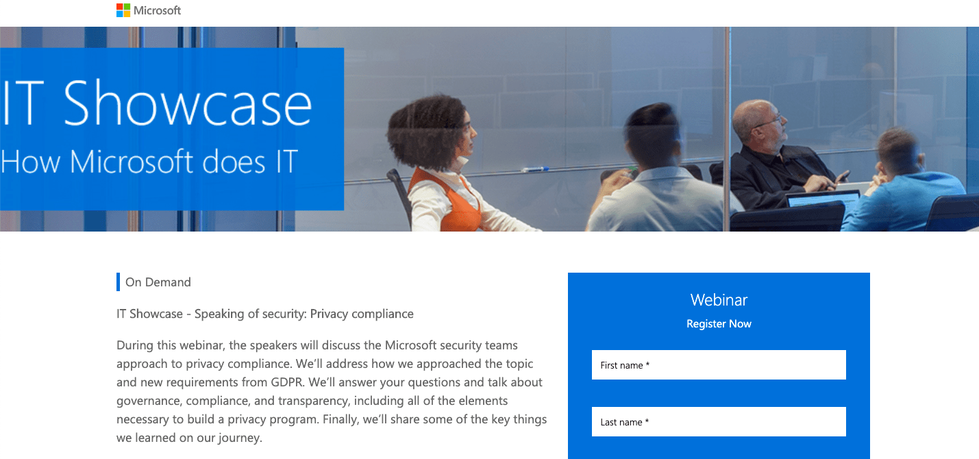
Microsoft has created a landing page to market and generate leads for a series of Microsoft’s IT Showcase Webinar. Why is this a successful landing page? Because it serves its purpose 100% and does not contain any misleading information. The seminar as well as the speakers are briefly introduced, while on the right side you can find a registration form. Apart from that, there are no buttons, links to other pages or additional information that could be perceived as disturbing.
Source: Hubspot
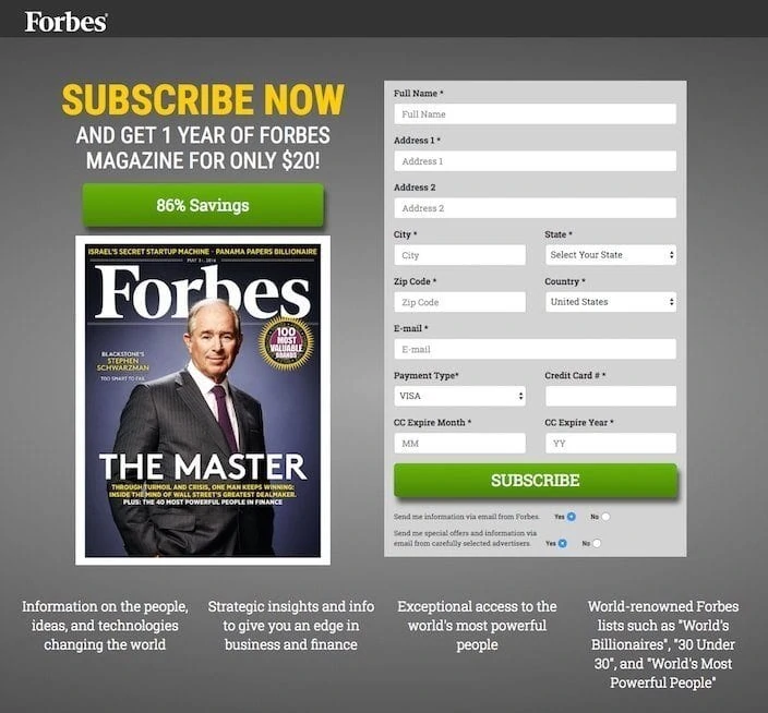
Forbes, one of the most successful business magazines worldwide, knows how to create a simple but effective landing page.
The advantage of a prompt registration to Forbes is being clearly communicated: 1 year for just $20, while at the same time the most important information about the magazine and what the reader can expect is briefly summarized.
Source: Instapage
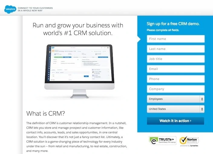
Salesforce.com is a San Francisco-based company that offers several Web-based solutions. Also a simple landing page, but one that conveys the main message very well: “Run and grow your business.”
The form and the CTA also stand out from the other text in terms of colour and thus motivate the user for a further action. The product is explained briefly and concisely. The additional “trusted” icons also help to build credibility.
Source: Instapage
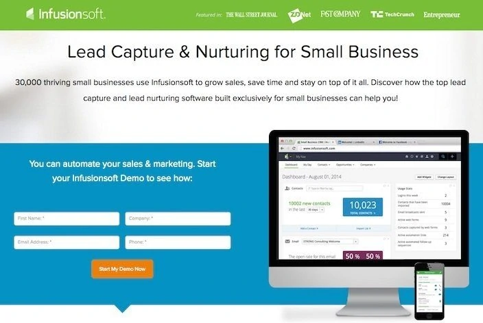
Infusionsoft is a sales and marketing software especially designed for small businesses. What makes this landing page special? Quite a few things!
In the foreground is the generally very neat design, in which the colour combination also harmonises very well.
Besides:
1. The CTA stands out completely from the other contents due to its orange colour.
2. The form contains only 4 fields.
3. The company logos in the top line serve as valuable references
4. “Social Proof” by a concrete number (“30000”).
5. The graphic shows how many contacts have already been generated and thus serves as a vivid “real-life” proof.
Source: Instapages
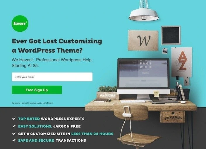
Fiverr
The company is based in Telaviv and is an online marketplace for digital services. The landing page of Fiverr catches the eye especially through the colour design and the illustration. The headline is formulated as a question and thus attracts the user’s direct attention. The advantages also stand out from the rest of the homepage.
Source: Instapage
Wix knows how to create an effective landing page to generate leads. Would be kind of weird if not. After all, it is one of the best known website providers. Especially impressive is the appealing design: The beautifully designed illustration runs through the whole landing page as a coherent “story”. And although you can scroll, the CTA and the main message are immediately recognizable at first glance (above the fold), at the top of the mountain.

Source: Wix
The Vimeo landing page is specifically designed for those who need video solutions for their business. The landing page has a clear goal: to convert visitors into leads and therefore also to avoid unnecessary links. A consistent CTA runs through the entire site to emphasize the same message several times.
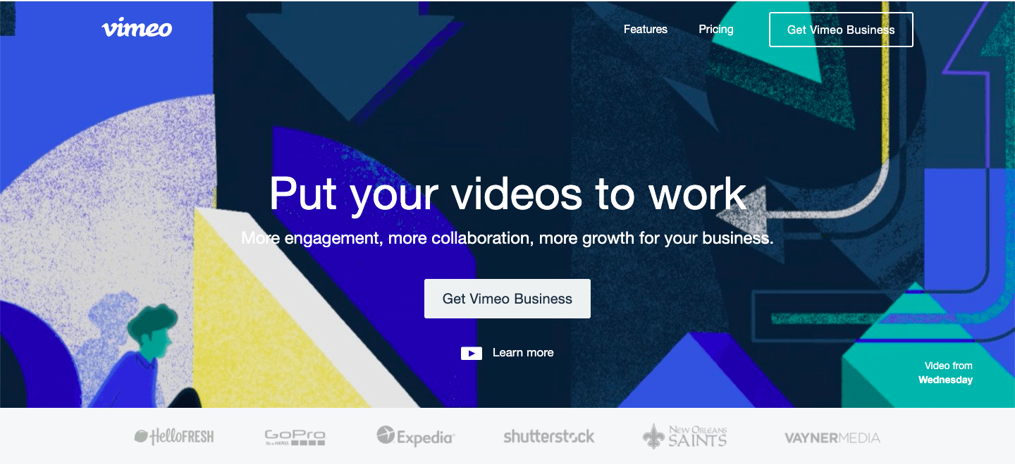
Source: Wix
This landing page convinces with a really very elegant and clean design. The most important messages about the product are summarized in the topmost area. All other information is kept short and concise to promote contact with the customer as quickly as possible.
Source: Unbounce
Ahrefs
A clearly readable main message and an outstanding CTA that stands out from the rest of the page, no distracting links and all important information at the top of the webpage – Ahrefs, probably the best known (and best) SEO tool on the market, provides a good example of what a landing page should look like. In the screenshot they also show directly the versatile functions of the tool and can thus convince the visitor at first go. .
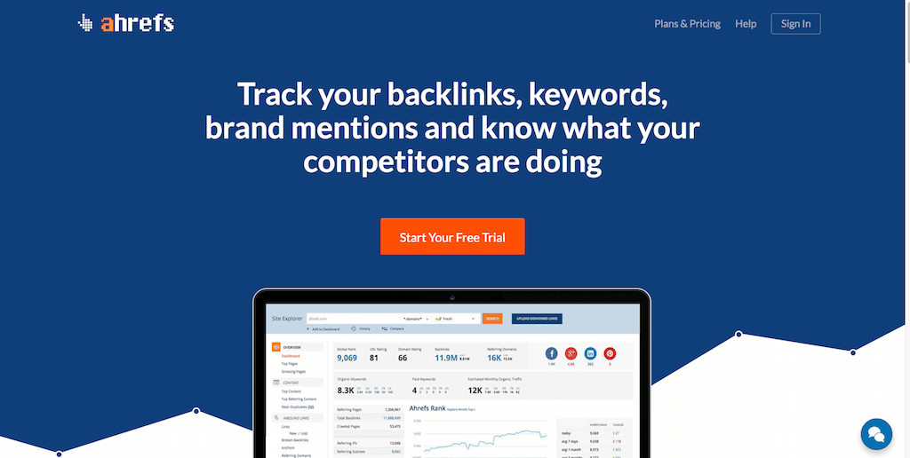
Source: Colorlib
A clear call to action and a minimalist design with just enough information characterize the landing page of the most popular streaming platform. A giant, like Netflix, should also be able to create a landing page. In fact, Netflix is taking a risk, especially with the red CTA (a color generally not recommended by marketing specialists). The colour “red” is synonymous with “danger” and could therefore convey the wrong intention. Well, we’ll turn a blind eye in this case, since it’s also Netflix’s corporate color.
Apart from that, the message is being communicated clearly and precisely and the form is kept simple: Netflix only requires an e-mail address – and that should be manageable for everyone. All in all a successful landing page.

Source: Fouseon-media
Did you stumble across effective landing pages that are missing in this list? Then let us know! You are also welcome to visit our latest posts “Creating an effective landing page” and “What is a landing page? ”.