
Top 9 Webdesign Trends in 2022
Marc Bachofner, March 6, 2022· Webdesign
Technology is changing every day. We are not only talking about computers, software or consoles. We’re also talking about web design. Every year, new opportunities seem to open up. Some persist and others peter out. As we did with the Web Design Trends 2021, we set out to find the trends this year as well. As a web design agency, being up to date is part of what we do. We would like to share this knowledge with you.
The 9 web design trends for 2022
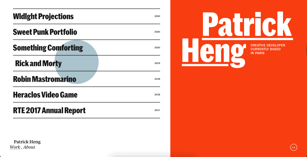
Webdesign Trend #1: Typography
Typography in web design is an ongoing topic. Which font should it be? How does the font relate to the font size? How big should the line spacing be? All questions you need to ask yourself when creating a typographic website. Not surprisingly, typographic web design is usually applied by web design agencies. If you want to produce your website yourself, then a suitable theme or template is recommended. You want to make the reading experience of your visitors as pleasant and perhaps as exciting as possible, so even small inconsistencies can ruin the overall picture.
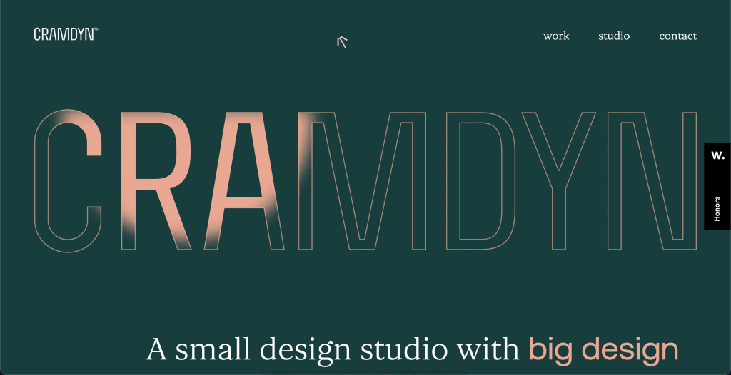
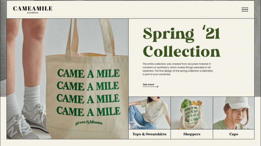
At Cramdyn (as of 02/17/2022) we see a super presentation with typographic web design. The homepage is dominated by the large lettering. This dominance is not bad, but makes the text a clear structural element. This is a core element of typography: the text becomes a building block and is no longer just the space filler.
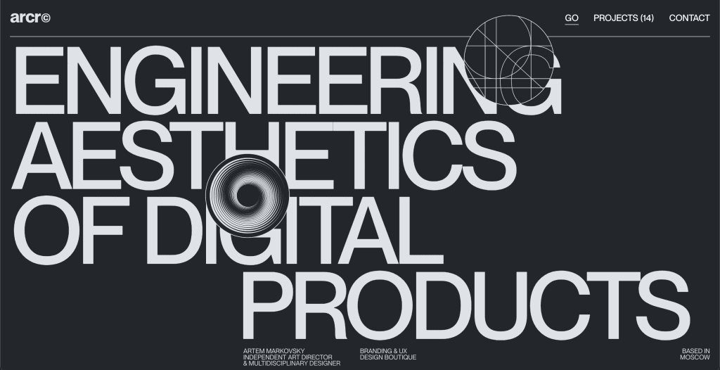
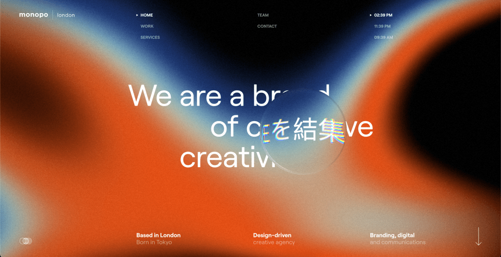
In a moment, another example of well-done typography from arcr (as of 02/15/2022). The texts stand out again. They guide the reader and lead him through the whole homepage. Once you have finished reading a block of text, your attention is already drawn to the next element. Typographic web design uses all the possibilities to make the text the center of attention. For some people, typographic web design is therefore also an honest approach, because you can’t just let an image speak for itself, you have to find the right words.
Webdesign Trend #2: Retro-Look
We know a phenomenon from fashion: certain styles, patterns or synergies reappear decades after their zenith. In the field of web design, this also exists – in a way.
Technological progress allows us to design our websites the way we want. There are virtually no creative limits anymore – let’s leave performance out of this. This also means that you can give your website a retro look. We’re not talking about copies of old design patterns here. We’re talking about combining retro elements with modern tools.
It’s also clear that a retro look must fit you and your products and services. Today’s tech giants would not convince with a retro look, as they stand for technical progress.
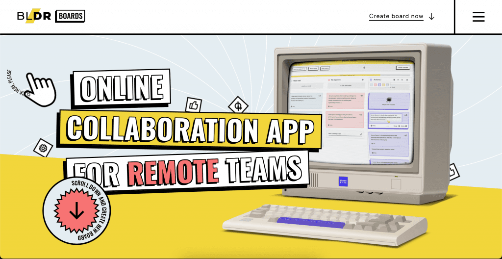
Again you can recognize the elements in retro style. Boldare Boards (as of 04.02.2022) has shown a very good sensitivity, because the web design is firstly a real eye-catcher as a visitor and secondly you can also find your way around. So design and usability go hand in hand and the retro look was optimally staged.
Webdesign Trend #3: Visible frames
Websites don’t have it easy. Better said: The producers of websites don’t have it easy. With technological progress and better and better tools, competition is fierce. So a website is quickly good or suitable, but the status stunning or perfect does not exist just like that. More and more has to happen in the background and on the one hand providers hide the codes of your website from the visitors. Others openly show how your website is actually put together.
One approach that stands for more structure and clarity is web design with visible frames. This is all about clearly separating individual elements. It’s like not removing the scaffolding altogether. The effect: the page becomes clearer and you can place more content without confusing your visitors.
Visible frames does not mean that everything has to be framed. It is enough if you draw the important dividing lines. This has mainly advantages for the overview, but well-done dividing lines are also visually convincing. Your visitors will thank you for this visual support.
The visible frames are often combined with a retro or 90s look. This interaction looks good and also makes sense, because visible frames were automatically there in the early days of web design. Fortunately, with time the look could be adapted so that we can talk about this web design trend today.
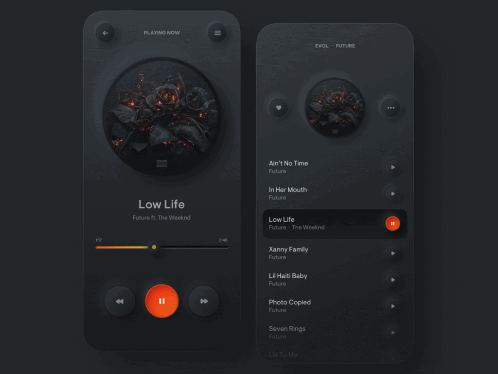
Webdesign Trend #4: Micro-Interactions
Not a style as such, but a web design trend nonetheless: micro-interactions. We will go into interactive web design later, this is about the interaction of individual elements and their effect. If you want to have a website created, you can count on your web design agency to explain the differences in detail.
An arrow that tells us to scroll. A sleek animation in the logo. A background image that moves smoothly. There are many examples of micro-interactions that make our lives easier, visually entertain us, or both. The important thing to remember is that these interactive elements are not the focus, they are not dominant, and they are meant to refine our experience.

With appropriate micro-interactions, your visitors are enticed to spend more time on your page. More time means a higher chance of closing the deal. And again, you can benefit from the unlimited possibilities of web design. Do you want to entertain your visitors with playful elements? Or do you want to prioritize user experience? With micro-interactions, neither is a problem.
Again, important to emphasize: Micro-interactions should not become the focus of your website. As soon as they become too dominant, you should start looking into interactive web design. At that point, different rules apply and you need to think differently. More on this later.
Webdesign Trend #5: Neo-Brutalism
Neo-Brutalism goes back to the architectural style of Brutalism. In Brutalism, raw building blocks like concrete were made visible. Plain backgrounds, simple fonts and unedited images. Neo-Brutalism is to show the bare truth.
This does not mean that websites in neo-brutalism look cluttered or unfinished. Rather, one wants to put the truth in the center. The unplastered and sharp-edged truth.
The style is perceived in such and such a way. It’s not one of those standards that just work, that’s why tuning it to your visitors is important again. This is also the reason why pure neo-brutalism is less and less to be found. What can be observed is that neo-brutalism relies more on minimalism. The sharp edges are reworked with minimalist web design, and thus re-staged. This combination of minimalism and neo-brutalism is viable and will be with us for years to come.
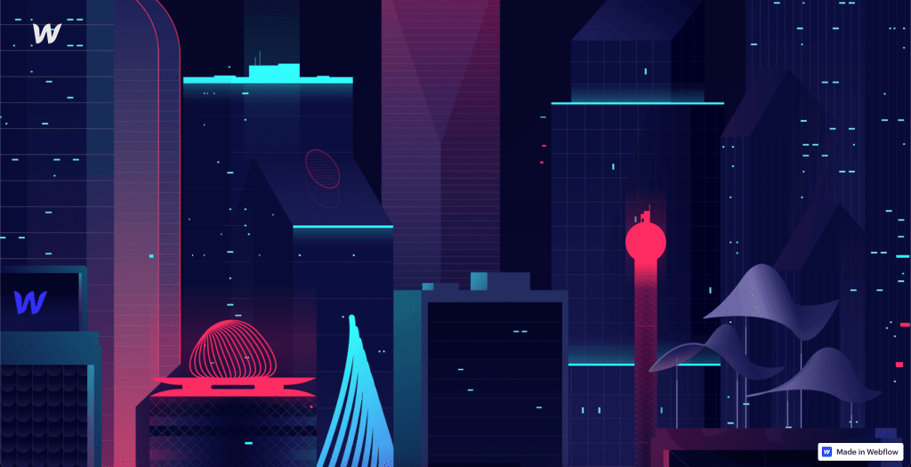
Webdesign Trend #6: Parallax-Effect
A personal favorite of mine: the Parallax effect. For the parallax effect, 2D elements such as images or text boxes are distributed over several layers one behind the other. Then each element or layer is assigned a different scroll speed. The result: a 3D effect despite 2D elements. The parallax effect creates the same image as when you look out the window on a train or in a car.
You can make the effect stronger or weaker. You can make it more or less in focus. However, the same applies to the Parallax effect: pay attention to performance. And also a very important point: the Parallax effect is not reliably supported on mobile devices at the moment. Remember that the majority of Internet users surf via smartphone. Of course, you can simply disable the effect for mobile devices. Make sure that your website is convincing with and without the effect.
The Parallax effect can be a wow factor or it can support your other web design. Work with a web design agency, then you can query different approaches. Let them show you what more or less parallax looks like. As with most web design concepts, an example is a better basis for discussion than an explanation.
Webdesign Trend #7: Page transitions and loading screens
Every website has loading screens and page transitions. Normally, these two elements are standardized. So kept simple or simply ignored. But a lot of potential is lost in the process. Just the fact that every page has these two elements shows how important the correct handling is and why it is a clear web design trend for 2022. The classic example: one pager. One-page design means a website that has exactly one page. Often, you can scroll very far on these pages because all the content is on a single page. This is exactly the creative approach to page transitions – you eliminate them.
Loading screens are a tricky thing. We know that a few seconds of loading time already makes the majority of visitors bounce. You can gain a few seconds with a creative loading screen. Your visitors will be busy looking at and processing your loading screen, and won’t notice that they waited a second more than they would have on a website without a loading screen. But again, keep loading times as short as possible. Make your loading screen too elaborate, and you’ll soon need a loading screen for your loading screen.
Page transitions can also lead to loading screens. Think about how a visitor experiences your site. If he has to stare at a loading animation every time he clicks on the navigation menu, he will quickly lose interest. As a rule of thumb, a visitor should only see one loading screen. For page transitions, fix the elements that don’t change and show only small animations in selected areas. Give your visitors the feeling that they will never really leave your site.
Webdesign Trend #8: Neo-morphism
The neo-morphism has been around for a while, but only in the last few years has it really been able to make its impact. It is a soft design. People work with shadow effects to make elements “float” or “sink”.
Shadows and gradients are the clear building elements for neumorphistic websites. And a clear web design trend in 2022. Also a clear distinguishing feature is the simple choice of colors. Neomorphism basically relies on one main color, one shadow color and one detail color. In other words, three colors that make up your website. At the same time, the shadow color is a modified version of your main color, so just two colors that define your character.
What visitors appreciate about neomorphism is its smooth appearance. A website with classic neomorphic web design is calm and perceived as a single layer with elevations and depressions. To be able to set a focus, this calmness is interrupted with other colors, because you still want to present certain elements to your visitors in a more dominant way.
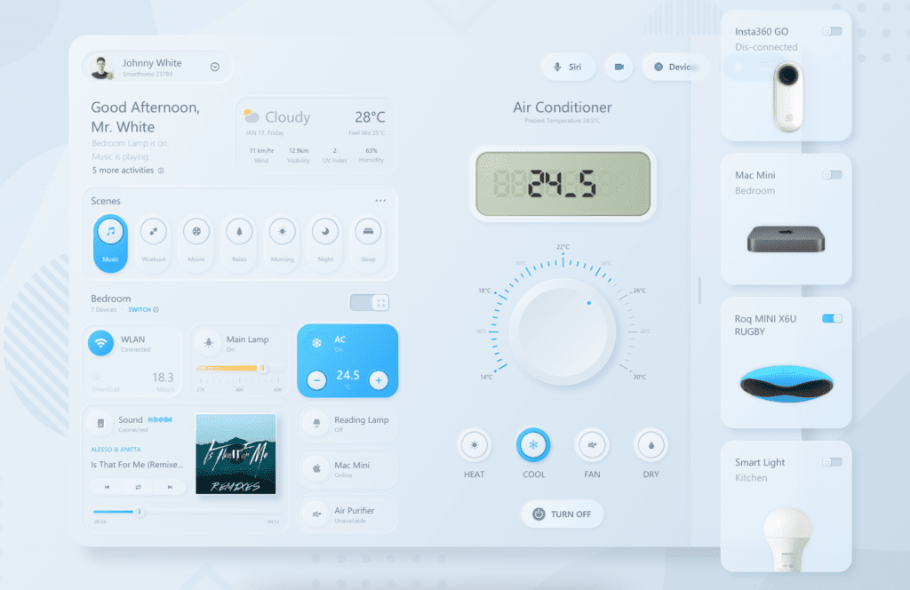
Webdesign Trend #9: Interactive Webdesign
We find interactivity more and more frequently in our everyday lives. Very fundamentally, every interaction between two parties is an interactivity. When I beg the coffee machine in the morning to fill the cup completely and it tells me something about descaling, we are interacting. Well, that interaction is not really beneficial for any of us. What is interesting is significant interaction with impact.
Interactive websites are very popular. That’s not surprising; we humans are always happy when our actions are noticed. The only question is how far this interactivity should go.
A button that changes color when you hover your mouse over it (hover effect). A product in an online store that becomes more present because you hover over it with your mouse. These little things are part of interactive web design. They can completely change the feel of your website and provoke more interaction with your visitors.
However, interactive web design is not only suitable for small things. You can also use more dominant interactive elements. For this, you need to keep a close eye on the performance of your website and the needs of your visitors. Do everything right and you will create an experience that will not be forgotten.
Interactions make your visitors engage with the elements of your website in detail. They want to find out what they can do and what effect their action will have. Let them experience your content in exciting ways.
Keyword experience. As already mentioned, you can control the degree of interactivity and its dominance. A website with dominant interaction is not suitable as an online store. Here, the needs of your visitors and your creative approach are too far apart. Match your creative approach to the needs of your desired visitors. If you “only” want to convey a message or tell a story, then you can go all out.
Conclusion Webdesign Trends 2022
Web design offers unlimited possibilities for your website. Browse the internet and find your web design inspiration. And don’t be too firmly influenced by website trends 2022. The right style for your business and brand doesn’t have a year printed on it. Do you want to find your style, then you can count on our web design agency. Together we will find your web design.