
The best landing pages 2020
Natalie Ediger, November 18, 2020· Interactive Content
The best Landing pages 2020
The year is coming to an end so let’s review it a bit. For a change it is not about corona, vaccinations or choleric leaders. We focus on digital marketing and show you the best landing pages of 2020. A landing page is a tricky thing – either a top or a total flop. If the landing page does not generate any leads, you have simply lost time and money.
To briefly refresh your knowledge, an effective landing page needs:
– a clearly recognizable CTA
– a precise message with the product benefits, being placed “above the fold
– testimonials for the social proof
– a form for lead generation and
– an attractive and clear design.
But easier said than done. Of course every landing page has to be tested and analyzed. In order to help you to get from”zero” to “hero” a little faster, I looked for some successful examples. Here are 19 landing page examples created by the pros for your inspiration:
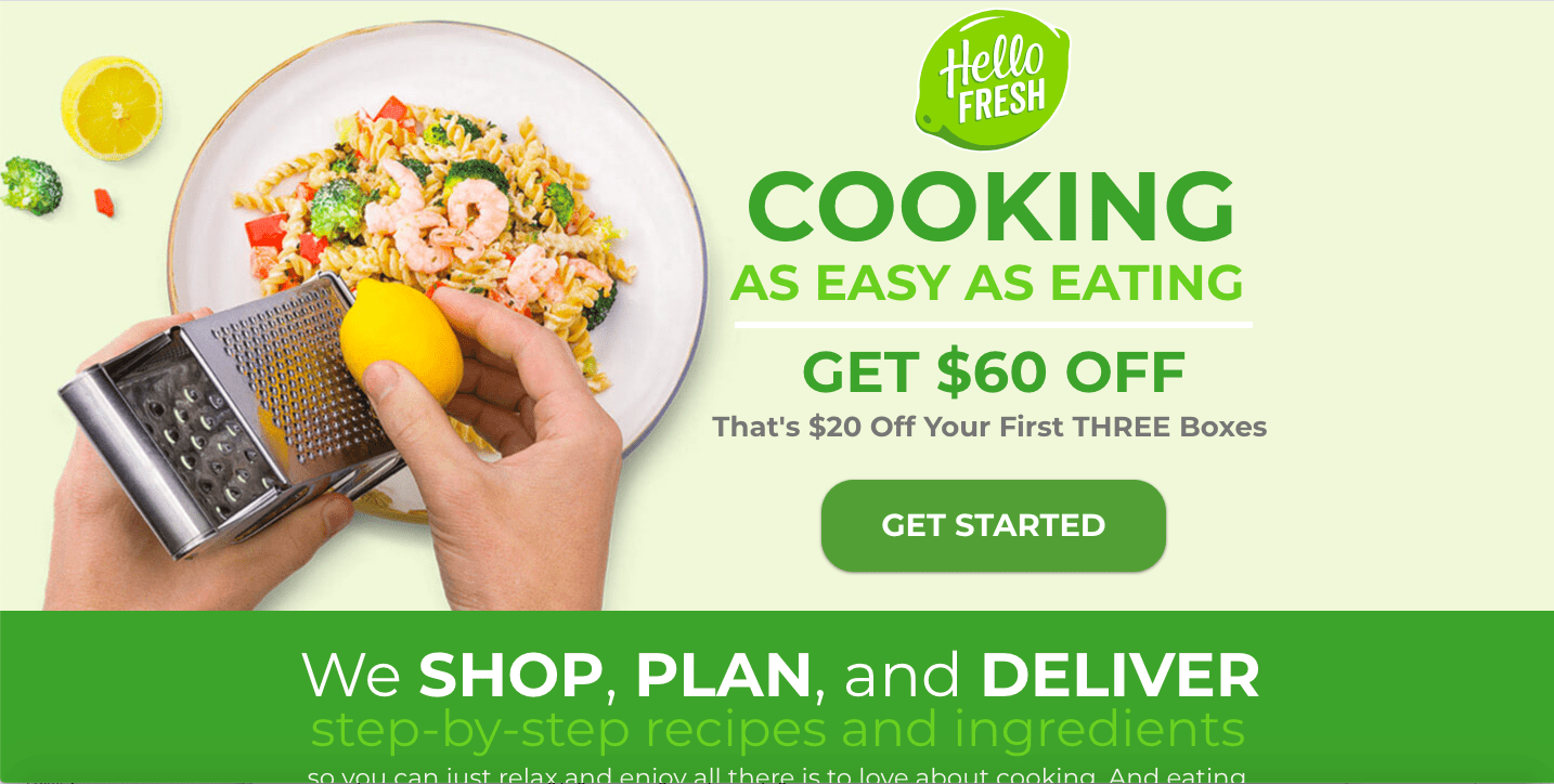
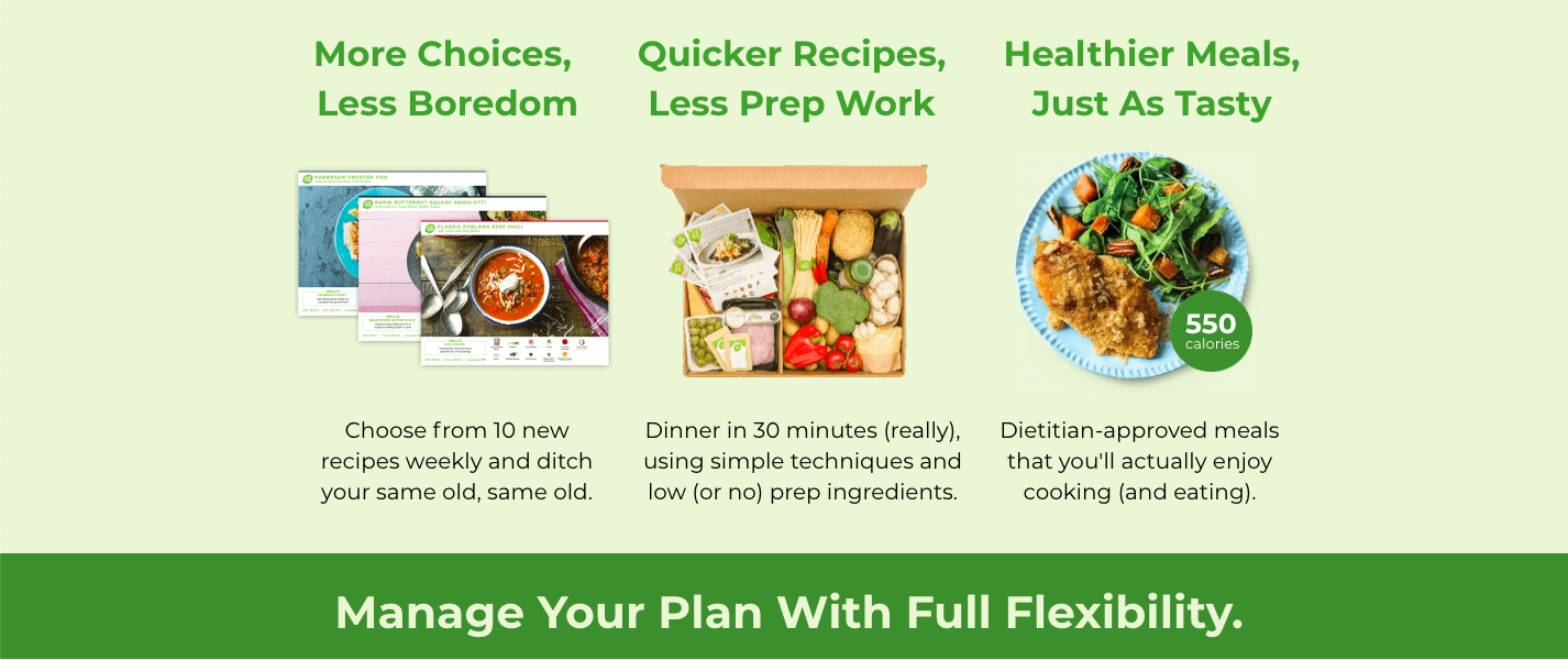
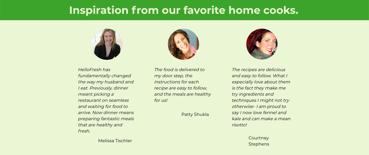
The developers at Hellofresh have taken several elements of a landing page into account.
Color contrasts for a better readability, a minimalist and well-structured design to not distract the user, testimonials as a social proof, an easily recognizable CTA (“Get started”) and a clear main message conveying the advantages of the service (“Cooking as easy as eating”). Apart from that, when you see these “fusilli agli scampi”, your mouth starts watering. Also, when scrolling down, everything continues to be structured: Enough information to introduce the brand. Not too much information to be overwhelming. Well done, Hellofresh!
Source: Growthmarketingpro.com
Here the visitor can see directly what he/she will receive after the submission of his/her data. A large package with a variety of products – you can look forward to it before you have even ordered. The entire design is festive and therefore an eye-catcher, especially during the Christmas season. The pink CTA stands out from the rest of the site and thus motivates to register. The mention of large renowned brands serves as a social proof and removes any doubts.
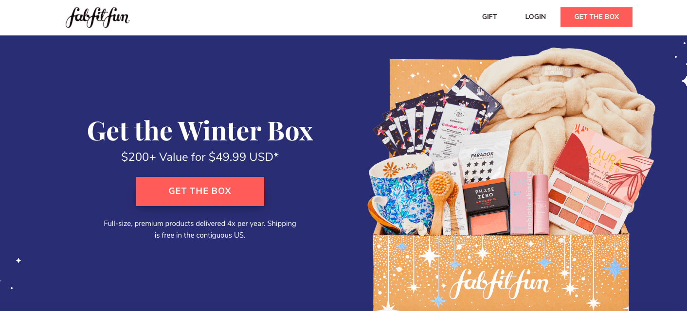
Source: Growthmarketingpro.com
AirbnB
AirBnB has already created several successful landing pages. Most of them all follow the same principle: clear, simple and with an easily recognizable CTA. This example here is particularly effective because it personalizes the respective offer. Based on the information entered by the user, a tailor-made solution is created.
And all this without any distracting “bits and pieces”.
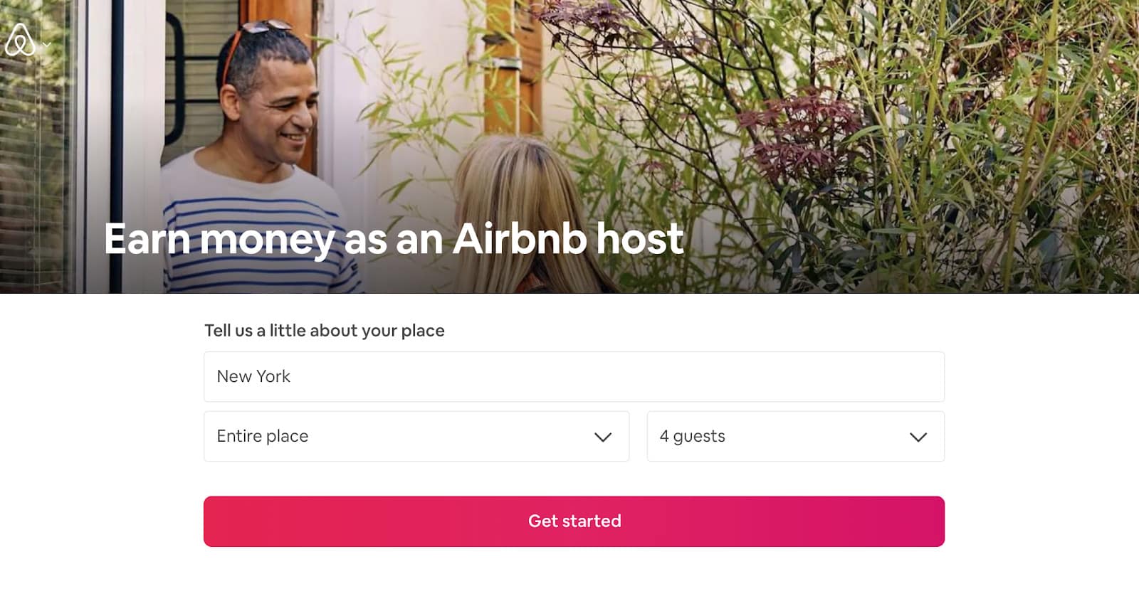
Source: Growthmarketingpro.com
If you don’t melt at the sight of this cuddly puppy, then I don’t know. The integration of visual elements that evoke positive emotions is an effective strategy to bind the user to the brand in the long term.
But the other elements also appear very harmonious: the warm pastel shades, combined with abstract elements and a clean design create a very beautiful overall composition. A successful landing page for the opening of a new pet store.
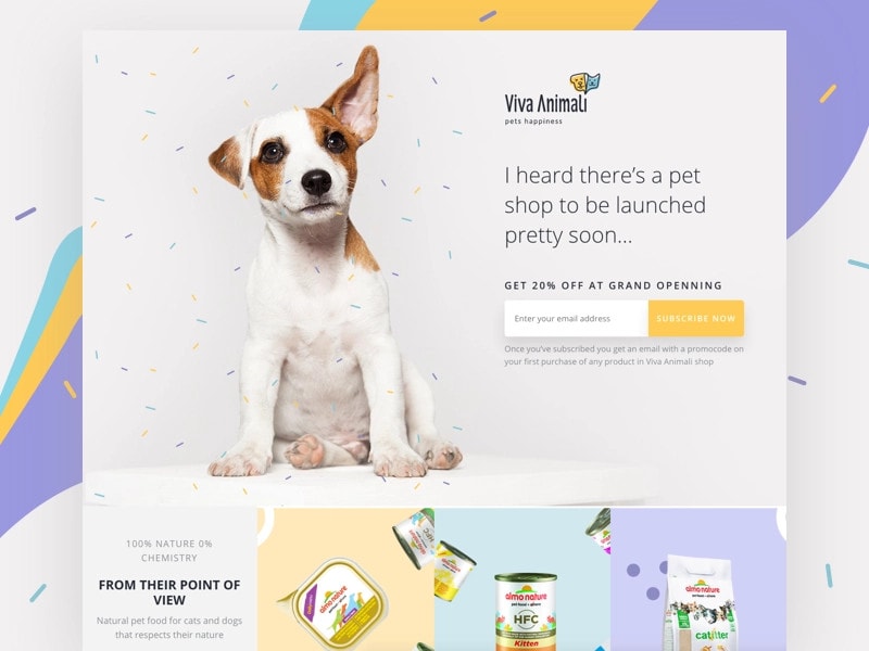
Source: Growthmarketingpro.com
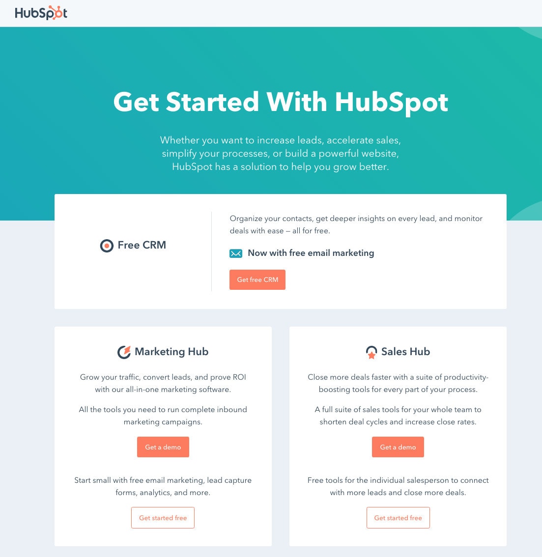
Not exactly a visual adventure, but that’s what makes this landing page so effective. Many companies fail to present just one product in a clear and concise way. Hubspot, on the other hand, presents three services at once and proves how segmented CTAs can also accommodate several target groups – and still be clearly arranged.
Source: Growthmarketingpro.com
A social proof, discount, images, clear CTA and a central message – on one landing page, still well-structured? Is that even possible? Yes! And Casper proves how.
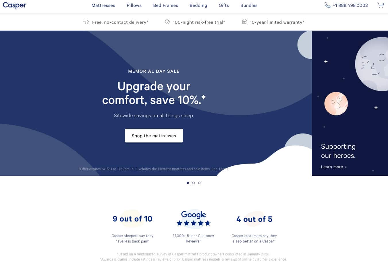
Source: Growthmarketingpro.com
An elegant and clean design and strong CTA immediately catch the eye here. The whole site also conveys a positive vibe and thus appeals more to the users.
When scrolling further, even more information about the product is provided, whereby everything appears very clear and harmonious. And if the user is still not completely convinced, there is also a large number of testimonials, which will probably dispel any remaining doubts.
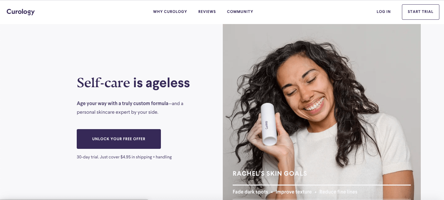
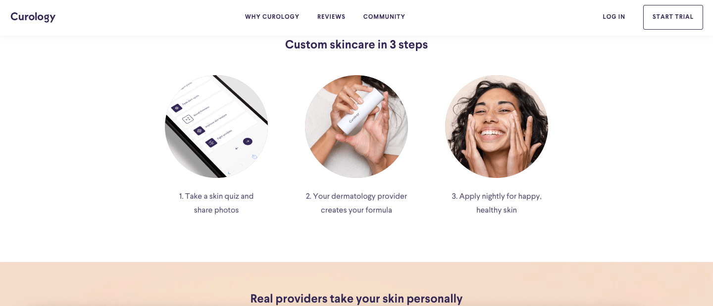
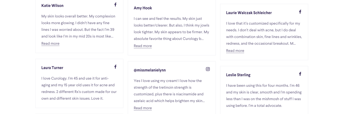
Source: Curology
Admittedly, the lettering on this landing page could stand out even better from the rest. But the use of a background video (not visible in the screenshot) attracts the attention of the users and motivates them to keep scrolling.
By the way, background videos for landing pages will probably also be a trend in the coming year. Check out this article to learn more.
Quelle: Growthmarketingpro
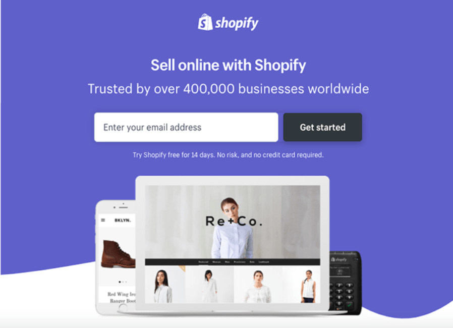
A typical effective landing page. Why? Because it is simple and structured and shows a social proof (“trusted over 400 000 businesses”). In contrast to many other landing pages, Shopify does not ask for unnecessary information, only for the e-mail address. The chances that the user actually registers are therefore very high.
Source: Hubspot
The overall design is very harmonious, the blue tones are fresh and energetic and the form is also kept short.
Why still doubt it? But if you are still not quite sure, hopefully the last concerns will be eliminated by the Q&A. Short and effective.
Source: Hubspot
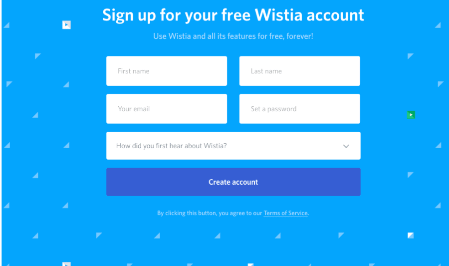
I have already mentioned this landingpage in an earlier blog post. The page convinces with a really elegant and clean design. The most important messages about the product are summarized in the upper section. All other information is kept short and concise to encourage the customer for further action as quickly as possible.
Source: Unbounce
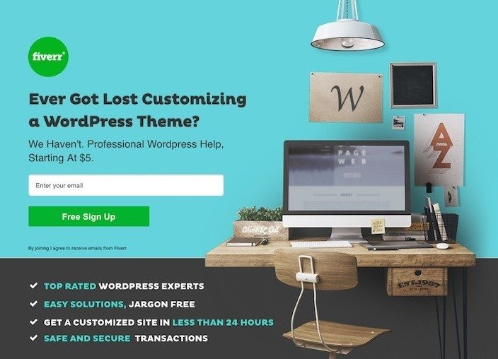
Fiverr
You might also know this landing page from one of my previous posts. But how could I not mention it again? The Landing page catches the eye mainly because of the color design and the illustration. The headline is formulated as a question and thus attracts the user’s direct attention. The advantages also stand out from the rest of the homepage.
The page deserves two places of honor. Because two are better than one.
Source: Instapage
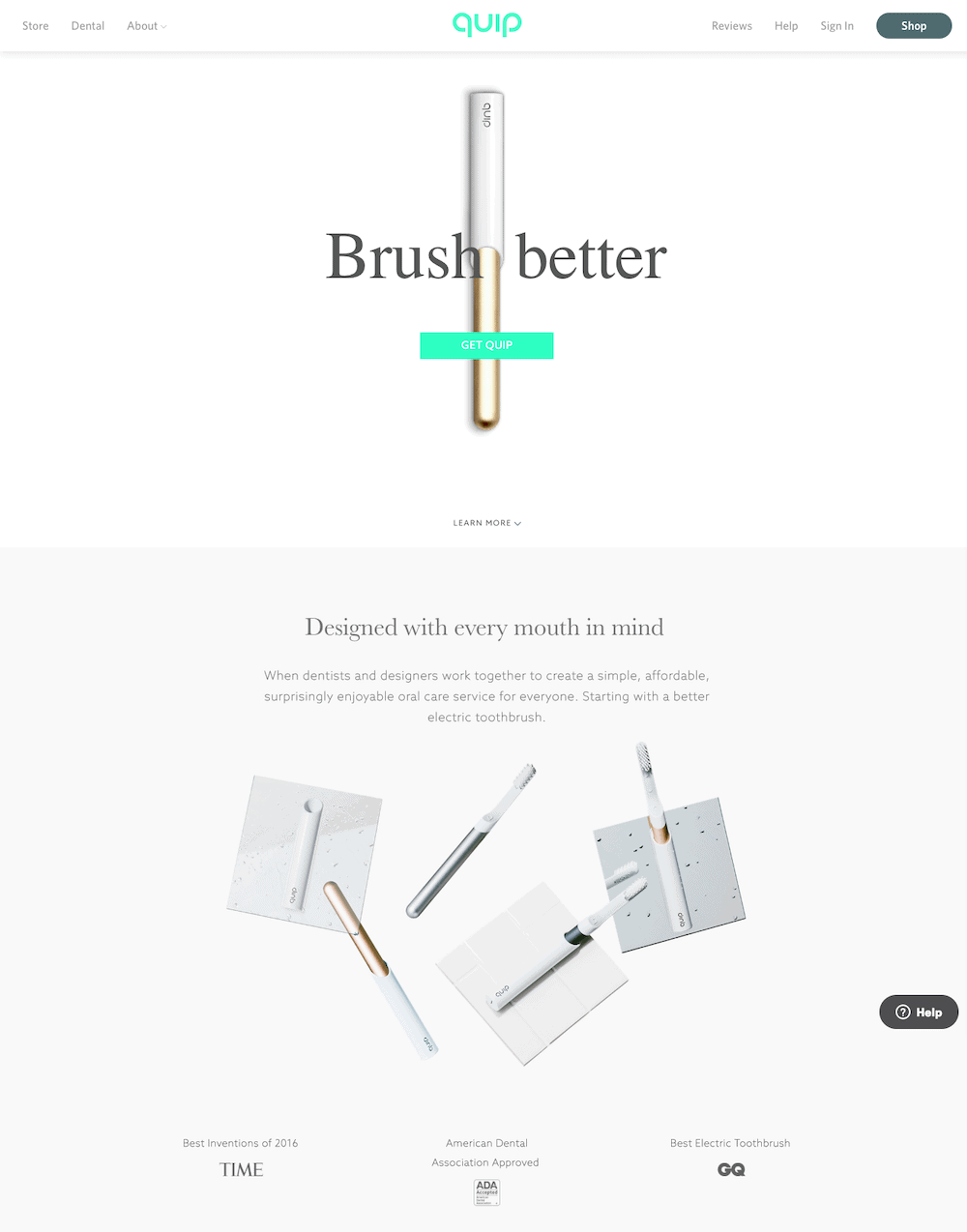
Quip is an electric toothbrush, which is mainly popular on the American market. I cannot judge how well the toothbrush cleans. I am also not a dentist. But the landing page is very nicely designed with a highlighted CTA in turquoise.
Also the headline is short, precise and conveys the USP. The message is supported by product pictures and noteworthy references.
Source: Instapage
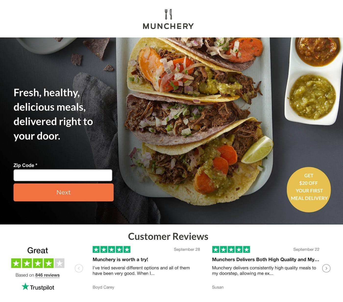
The service is being explained at first glance – fresh meals directly to your home. Plus a highlighted CTA, over 800 customer reviews and juicy tacos that make your stomach growl. Well then, enjoy your meal!
Source: Instapage
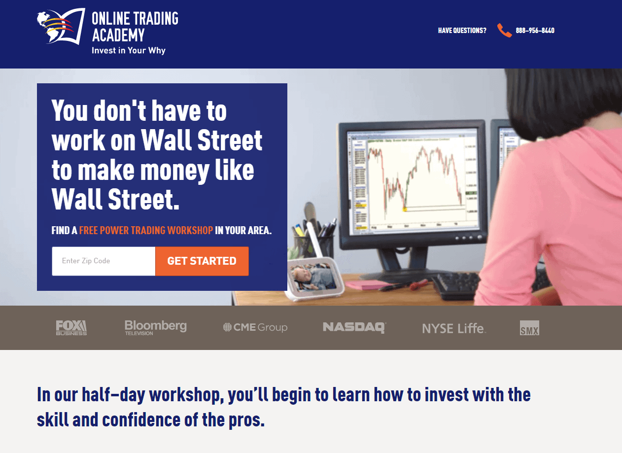
This striking headline resonates with all of us (and gives us hope): Even without Wall Street we can get rich! Renowned brands serve as social proof. And the “Color blocking” design in dark blue and orange stands out and is in line with the corporate colors.
Source: Instapage
A directly recognizable promise (180 blog post ideas) motivates the user to fill out the form. And apart from that, an interesting, diversified design with a real wood background and the “must haves”, which should not be missing in a blogger’s life.
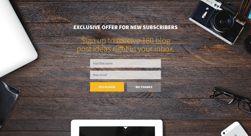
Source: Instapage
A landing page of a different kind! For an anniversary event of TPL, the Cleverclip team was allowed to create an interactive landing page, which should serve as information and registration portal for an event. With playful elements the user is led on a visual journey through the company history of TPL.
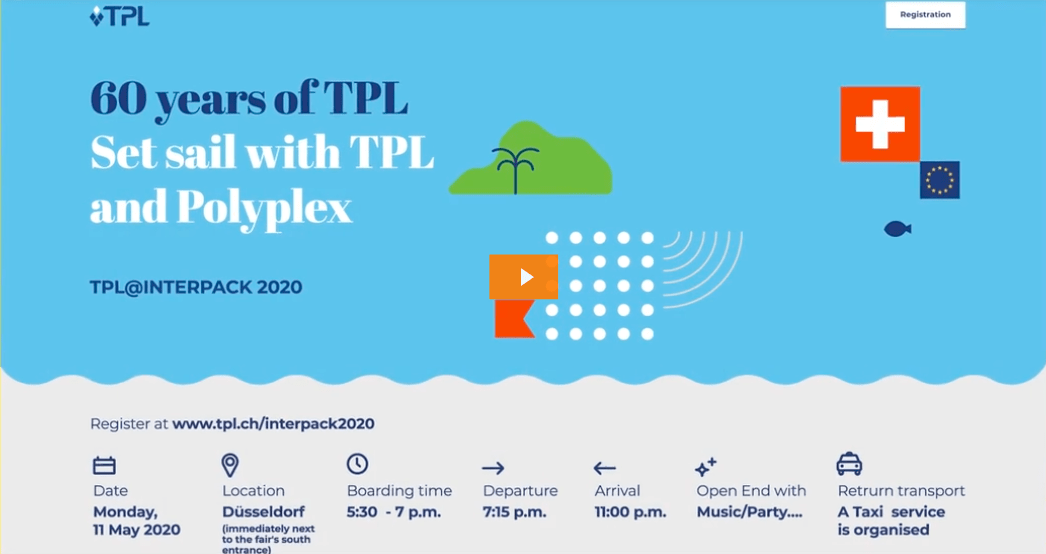
Source: Cleverclip
What a magical design: The beautifully created illustration stretches across the entire landing page as a coherent “story” and thus motivates you to keep scrolling. But even without scrolling, everything is brought to the point straightaway. Because the CTA and the main message are recognizable at first glance (“above the fold”), at the top of the mountain.
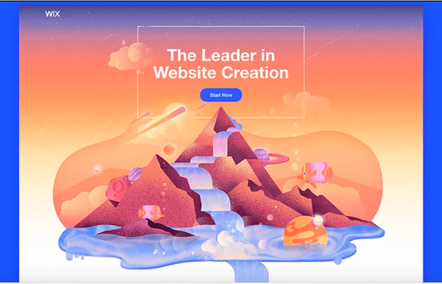
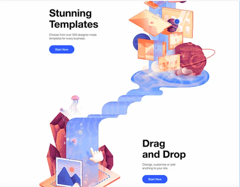
Source: Wix
So the list has reached the end. Have you come across one or the other exciting landing page that deserves a place of honour in this list? Then let us know! If you want to learn more about the topic of “Landing pages”, check out the other articles: