
Infographic Trends 2021 – All you need to know
Natalie Ediger, December 2, 2020· Infographics

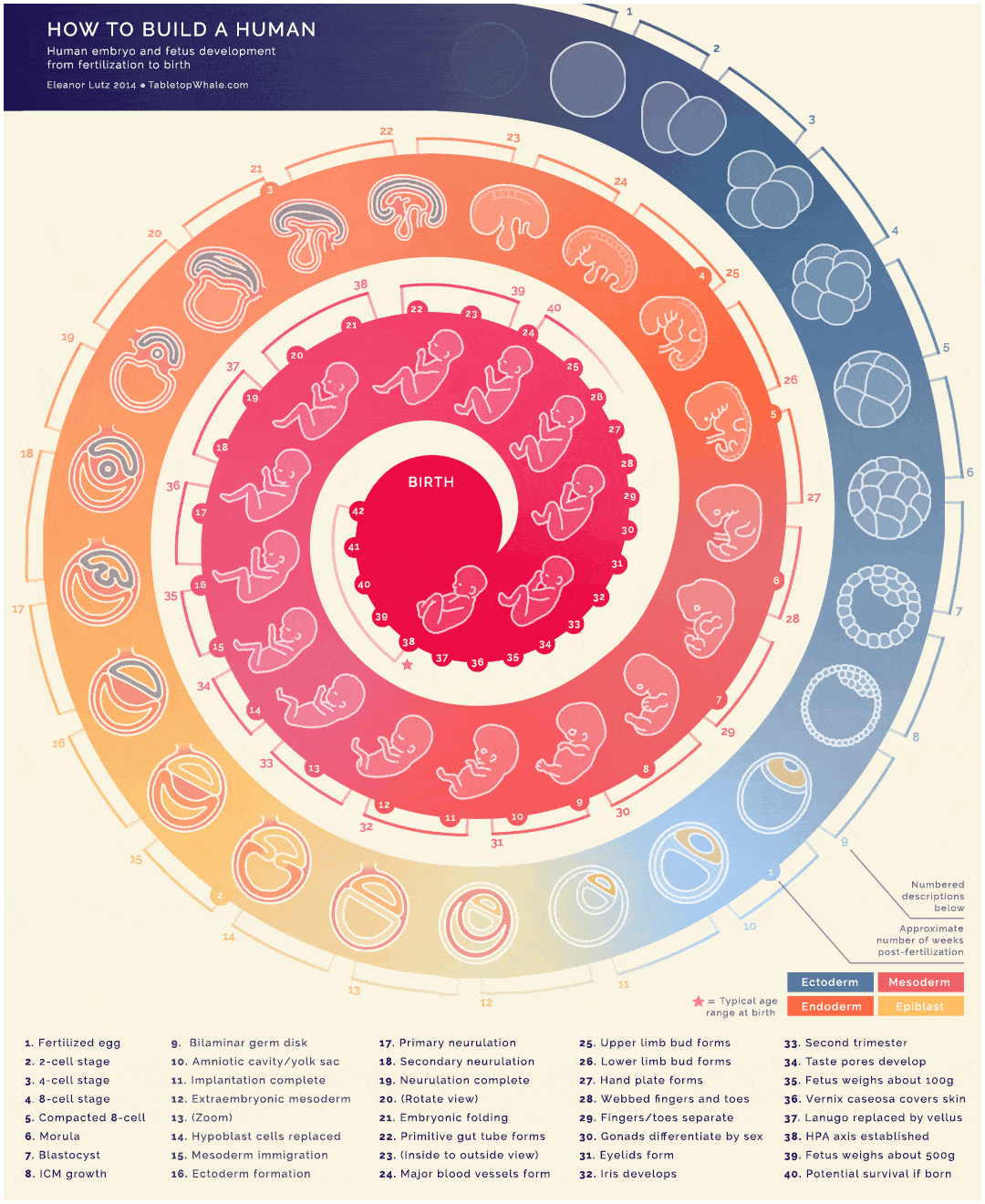
Posts, Stories, Tweets, Likes, Uploads, Downloads…that is the everyday life of the average citizen. Since there is so much content out there, it is no longer enough to create static average content. The content must be appealing and inviting. In the area of data visualization, one format in particular has therefore proven itself: The infographic. Infographics pack dry data and facts into a story and thus make even complex information accessible to everyone.
To ensure that you remain competitive with your infographic in the coming year, I would like to share with you today some infographics trends for 2021. From web design, animation trends or formal things, here you will learn everything you need to know to stand out from the crowd with your infographic. Stay tuned. 😉
Infographic Trends 2021
Video Infographic
Videos here, videos there, videos everywhere. Videos are and will remain the most popular content formats for users. According to Cisco, videos will account for about 82% of all Internet traffic by 2022. So it is definitely worthwhile to integrate a video into the content strategy. A video infographic is a visualization of data in the form of an (online) explainer video. It thus combines the most important content elements: moving images, storytelling and the communication of important information.
This does not mean, of course, that every static infographic has to become an amateurish video from now on. On the contrary: it must of course be appealing and professionally designed to effectively address the target group. Ideally, you should use video infographics for topics that cannot be simply explained by a static or simple animation.
Interactive infographics
Interactivity is the future of content marketing. Today it is no longer enough to address the viewer with static content. For this reason, interactive content will continue to play an important role. Interactive infographics usually have links or special buttons that release more information after clicking or scrolling with the mouse pointer. On the one hand, this allows a variety of information to be accommodated without being overwhelming. On the other hand, even complex and dry data can be packed into an appealing user experience.
With an ever-increasing flood of information and especially after a turbulent year in which statistics have reached new heights, we can expect the trend to continue. By the way, we recently introduced the best interactive infographics 2020. So if you are still looking for some inspiration for the coming year, please feel free to check out this article
GIF infographics
Sometimes just a few moving elements are enough to give the infographic the decisive wow-effect and to attract the user’s attention. And this is exactly what GIF infographics are for! Unlike interactive infographics, this is not a separate website. This makes the content ideal for social media channels, as they create a lot of engagement and are shareable. Here’s a sneak peak of what a GIF infographic could look like exactly:
 Source: spielcreative.com
Parallax Effect
Parallax is an optical illusion in which objects close to the observer seem to move faster than objects further away. The web design geeks expect this animation trend to continue next year – and it will certainly be reflected in the infographic design as well. With the help of movement, the illusion of depth is being created. This gives every data visualization an additional wow-effect and raises the user experience to a new level. The following animation shows what this could look like:
Click here for the interactive version.
Typography
An infographic is usually divided into visual and text-based elements. And although pictures and graphics usually form the core of the infographic, the writing is crucial to convey important information. Creative typography has been a constant trend for many years and will not be out so quickly in 2021. In this context, kinetic typography and oversized typography will play an important role.
With kinetic typography, the letters are in motion and thus bring any infographic to life. An infographic with kinetic typography can be designed much easier than, for example, a completely interactive infographic. Nevertheless the movement is enough to attract the attention of the target group.
Oversized typography is particularly popular because it quickly catches the eye. And since we are all too busy in the fast-paced digital age to spend even 5 seconds on something, we need to get noticed immediately with our content.
Mobile first design
Mobile Internet usage continues to grow. 67% of the entire population now owns a smartphone – this figure has increased by another 2.4% this year (McSchindler). And I don’t expect the smartphone to become a lesser survival tool next year ;). Meanwhile I am almost amazed (and happy at the same time) when a 5-year-old child holds a toy and not a smartphone in his hand.
Since infographics are a particularly effective format for social media, it is definitely worth adapting them to the smartphone format. Otherwise you will miss out on a large part of your target group. Make sure that all fonts are easy to read and that all interactive elements can be opened and played on the smartphone.
Data visualization with the help of VR and AR:
Virtual reality (VR) and augmented reality (AR) are currently in the spotlight when it comes to user experience. In virtual reality in particular, the user is directly immersed in the event and becomes part of the experience. In the field of infographics and data visualization in general, more and more possibilities will arise in the future to visualize information three-dimensionally and as an immersive experience. This could become especially interesting for highly complex data, which in this form offers even more potential for analytics.
Real-time infographics
This year has shown us how quickly everything can suddenly change. Especially in the area of data visualization, daily adjustments had to be made, statistics updated and new information revealed. Johns Hopkins University, for example, publishes data on the worldwide pandemic development on a daily basis, thus laying the foundation for a new trend in the infographics area: real-time data visualizations.
Infographics, which, depending on the topic, change the content in real time, not only look particularly interesting and vivid for the user, but are of course also enormously informative in order to convey new updates quickly.
Different design trends
I did some research among (graphic) designers to find out how the creative world could influence future infographic designs. 2020 was a year like no other in history. But it was also a year in which the digital possibilities have spread even further and our relationship to technology has changed drastically-and the creative world has also been affected by it. We can therefore expect disruptive trends above all, which could also be reflected in the field of infographics:
Based on maximalism and inspired by different eras and movements, we can expect many futuristic and retro looks.
Extraordinary color combinations: Seamless color gradients are currently passé again. The 2021 color palettes are all about contrasts and dissonances. This kind of “color-blocking” can also be easily integrated into one or the other infographic.
Psychedelic designs: The chaos from this year will of course also be visually noticeable. Complex abstractions, distorted forms and a partly excessive use of color will become part of the 2021 art scene. A data visualization in a psychedelic look? This is definitely how you will attract the attention of your target group.
Infographic Trends 2021 – Conclusion
The world of data visualization is exciting and constantly evolving. And this year has shown how important it is to take a closer look at statistics and facts ;). Regardless of the industry, an infographic is ideal for many different areas to convey a message briefly, concisely and clearly. If you keep an eye on some of these trends for the coming year, nothing should stand in the way of your infographic. And if things don’t go quite smoothly after all, don’t worry! We are experts in this field and will be happy to help you ;). Let’s get in touch. Btw, if you need a little more inspiration, here are the best interactive infographics 2020.