
Landing page trends 2021
Natalie Ediger, November 17, 2020· Interactive Content
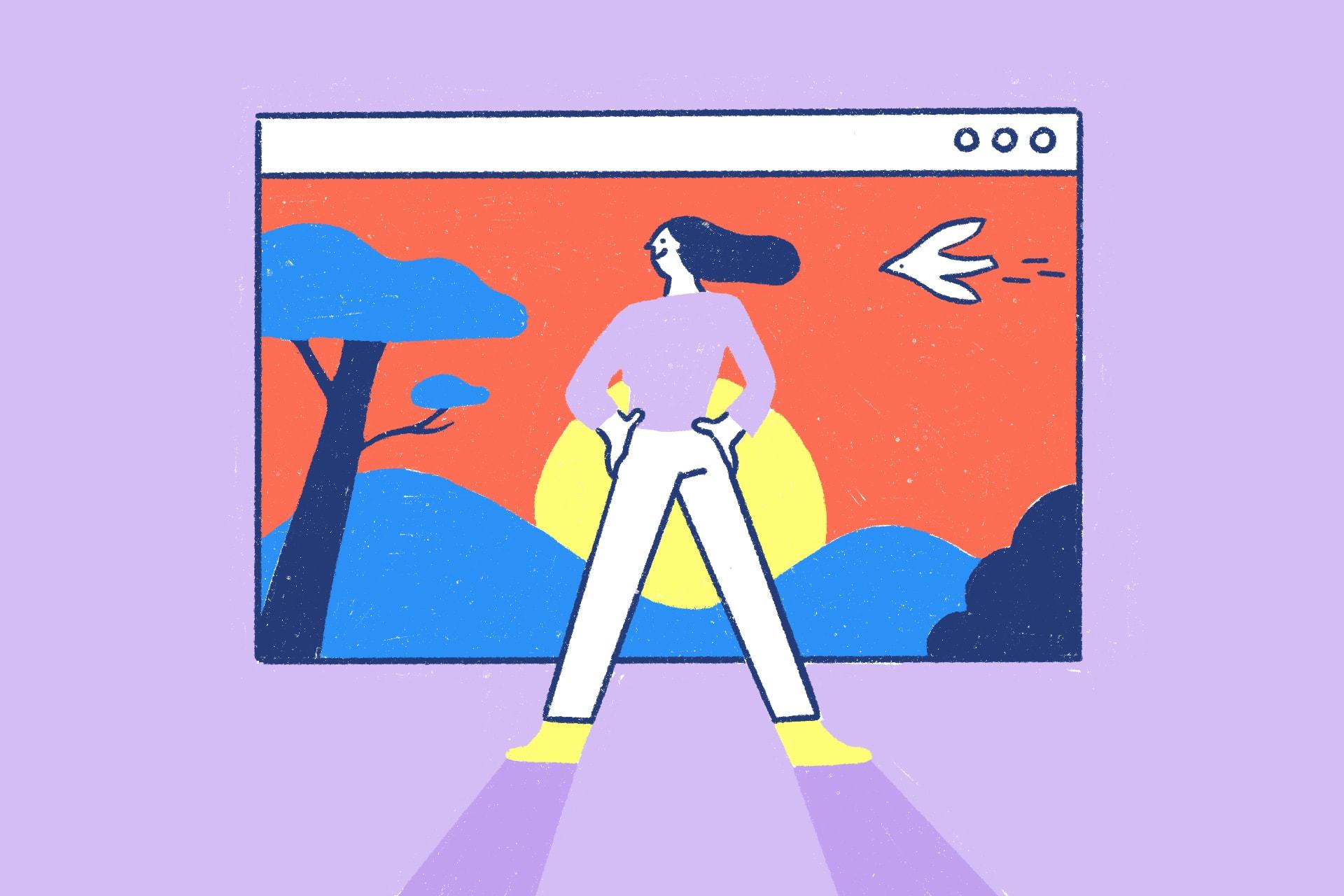
Landing page Trends 2021
The technology continues to develop and with it arise new possibilities and requirements. This also applies to web design. Landing pages have proven to be important tools to generate leads and achieve conversions. However, to effectively reach the target group today, the site must be user-friendly, have an attractive design and also offer a breathtaking user experience. And as if that wasn’t enough, you should also always be on top of the game. To help you achieve these goals, I would like to present some landing page trends for 2021 in this post.
Forecasts are never easy, especially not after this year. But based on the developments of recent years and in connection with the digital progress caused by the pandemic, I dare to discreetly predict the coming year. 🔮
Website Speed
Fast. Faster. 2021, yes, I can’t wait to leave a turbulent year behind me, but that’s not what I meant. Speed is the motto of the digital age. And while everyday life took a break this year, we can’t say the same about digitalization. Today’s user is not exactly patient because of the overstimulation. For this reason, the visit to the webpage should be smooth and efficient – and that starts when the page is opened.
In fact, 53% of mobile web page users leave a page that loads for more than 3 seconds. No matter how beautifully designed the page may be. If the elements do not load, the user is gone.
Take our friend Google as an example: The expert always tries to stay below 0.5 seconds. Since we do not expect a reduction of the stimulus satiation in digital marketing in the coming year and especially in post-covid times (if it ever comes to that), short loading times will continue to be very important.
Mobile First Design
Mobile usage accounts for about half of the worldwide web traffic. In the 2nd quarter of 2020 the share of mobile devices was 51.53%. 67% of the total population now owns a smartphone – this figure has increased by a further 2.4% this year.
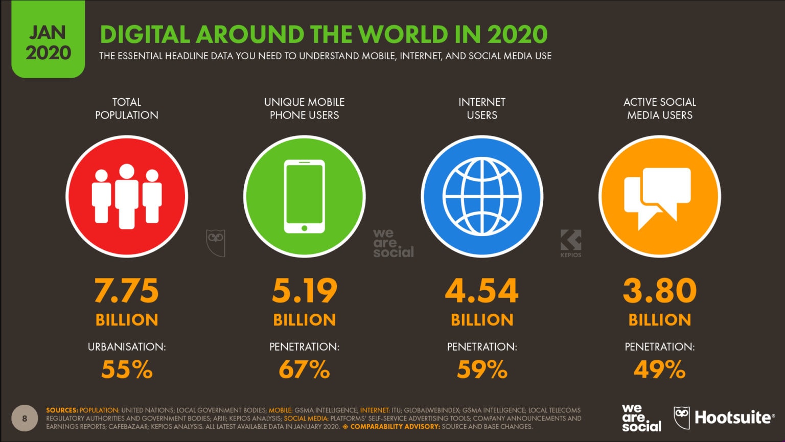 Quelle: www.mcschindler.com
With the advance of technology and increasingly modern smartphones, which have become a survival tool anyway, we can expect mobile Internet use to increase steadily.
The probability that the user will land on your landing page from the cell phone is quite good. This means that you should take this “mobile first” trend seriously and make the landing page as mobile-friendly as possible.
The size of the screen should be taken into account. A common problem is that many elements of the desktop version are cut off in the mobile display. Also all content should be “responsive” and easy to read, have short loading times and be clickable without problems. Avoid using too small font sizes or software, such as Flash, which cannot be played on the mobile device.
Thumbfriendly 👍
With the mobile optimization a new buzzword has been established: “Thumb friendly”. By that I mean an easy handling or navigation, reached and controlled with the thumb. Because you probably hold the cell phone just like me or the fictitious person in the following picture:
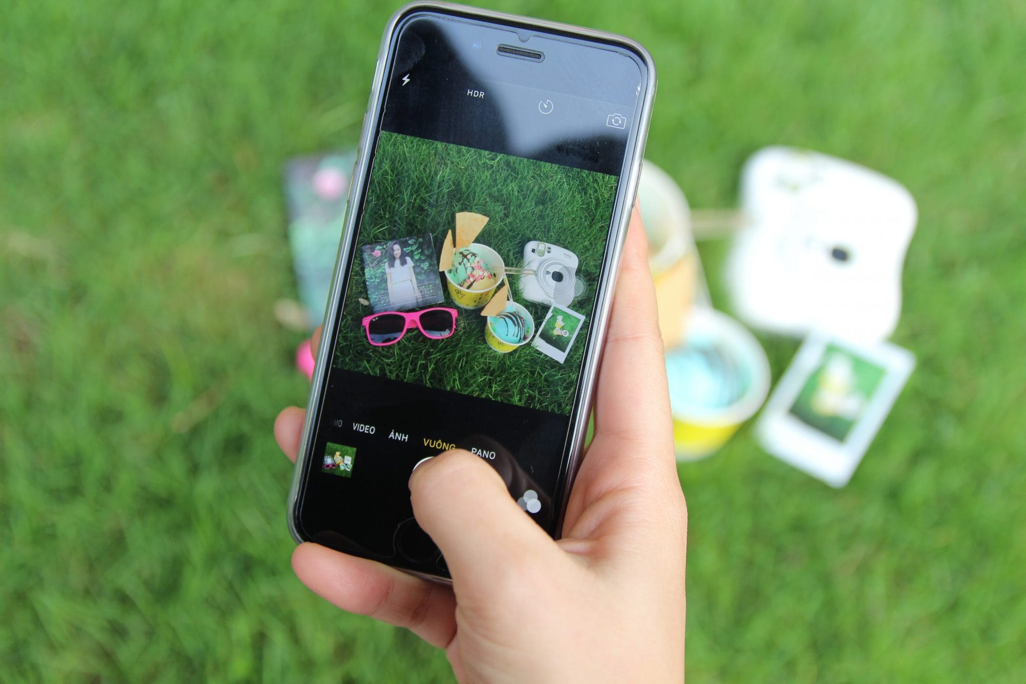
With a thumb friendly design, you contribute significantly to the user experience. Nobody today has the time to move 2 fingers. 🙃
Dark Mode
Sounds a bit like a remake with Darth Vader. But with digitization and increased screen time comes eye fatigue. For this reason, especially tech giants like Apple nowadays offer the option to switch to a dark mode. To keep it simple: Light pixels become dark and dark pixels become light. Most of the time the usual white background becomes deep black, while the black font shines white.
Your landing page should therefore also take this trend into account and offer a button to switch to dark mode, for example. Whether the dark mode really reduces the visits to the ophthalmologist or is a pure hype can be debated. In fact there is no official study that proves a positive effect. From my own experience I would say that the dark screen does indeed feel more comfortable.
Personalization of content
Oh how spooky it is sometimes, when we search for a product on Google and it appears a few minutes later in ten variations on Facebook. It is no longer a secret that the entire WWW has become our everyday stalker. With the help of tracking tools, our browser history is followed, our behavior is analyzed and based on this, a product or webpage is suggested.
Personalized content is simply more effective today. With automated tools or QR codes, for example, the user can be addressed personally, thus increasing the customer experience. Personalized experiences can also be created with the help of interactive elements, e.g. a quiz, a video or special clickable buttons based on user preferences.
Personalization also plays an important role in forms. Forms where visitors enter their data are essential to generate leads. In return, visitors receive, for example, an e-book, access to an online course, etc. However, many companies turn this form into a novel with more fields to fill out than a tax return. Rather use progressive forms with information that is really relevant. If you do not need an address, do not ask! This allows more conversions and less frustration for web page visitors.
Infographics
I officially declare this year as the year of endless statistics. Because of Covid-19, the Internet was almost flooded with number-heavy charts, explanations, forecasts and analyses. However, attracting the attention of the target group with the help of statistics is not an easy task. How good that there are infographics! Infographics pack data into a visually vivid story. Especially on a landing page, a well-designed infographics is not only a feast for the eyes, but also conveys all necessary information to the target group quickly and clearly.
And as the situation develops so far, I cannot imagine that data visualizations will not play at least as important a role in the coming year.
Explainer or background videos
Video is King – I don’t know how many times I have already written this. But this only shows one thing: Videos are and remain effective marketing tools and should not be missing on your landing page next year.
But remember, a landing page should be clear and not too powerful. A long video is therefore not entirely suitable, but shorter explainer videos can answer exactly the necessary information and turn visitors into customers. Even background videos (even without sound) can increase the visual appearance of your landing pages.
Interactive landing pages
We at Cleverclip love and live interactivity! Interactive content has also become an absolute “must” in digital marketing and not without reason: It not only gives the user a lot of pleasure but also provides valuable data! Users interact more strongly with the content, thus becoming more involved with the brand and storing information in long-term memory.
The possibilities for your landing page are endless here: quizzes, short games, interactive buttons and animations, calculators, etc. The future of content marketing screams for interactivity!
Numerous design variations
We actually know it from the fashion industry: design trends change constantly and suddenly the old sweater from the 90s is hip and trendy again. Of course only for 1 week, because then Paris, New York and Co. will announce the next trends. More or less the same happens in digital marketing. Due to technical progress and the changing demands of society, digital designs have to be constantly adapted to provide a maximum user experience.
Which visual elements should a successful landing page have in the coming year?
Minimalism and negative space: Not really a trend, but an important basic requirement of landing pages. Nevertheless I wanted to include it in this list. A landing page should always be structured and not distract from the most important information. Negative space in particular makes it easier to process the content and doesn’t make it look overwhelming.
Individual illustrations: As mentioned before, personalization plays an important role. Stock images have already met with little response this year and I don’t see any turnaround here. Rather rely on custom illustrations that are in line with the corporate values and brand message.
Oversized typography: Whether desktop or smartphone, the main message must be easily readable and recognizable at first glance. After all, the average user scrolls down once, up once, and away again. Extra-large reading fonts attract attention and convey the information effectively. A particularly popular trend here is kinetic typography.
Accessibility
Accessibility on the Web means the unrestricted accessibility of websites for a large number of users – regardless of their physical, cognitive and technical requirements. An elaborately designed landing page may look nice at first glance, but for many users it can seem like a chaotic mess.
The following points can be implemented:
Set color contrasts between text and backgrounds,
Use of focus indicators, such as rectangular outlines
Alt tags for images (is also especially effective for SEO)
Making a landing page accessible to people with disabilities is not exactly a trend. But in fact this development is still being implemented by far too few companies. This is one reason for me to include this point in the list.
Landingpage Trends 2020: Conclusion
The coming year should bring us new options for digitalization, more interactive formats and personal content in web design. And I am looking forward to that! You can’t plan everything, but anticipation is still the most beautiful joy. Especially after an ambivalent year, which we all probably did not expect.
So, whether it’s digital marketing, your landing page or a coffee klatch with friends, let’s hope for more exciting possibilities with lots of interaction. What trends do you expect?