
Creating an effective landing page
Natalie Ediger, August 19, 2020· Communication

A well-designed landing page can be decisive for the success of your product sales, as it enables you to attract the right customers for exactly the right offer. Unlike regular web pages, it does not contain “unnecessary” information that distracts from the main goal. At least that’s the basic idea of a landing page. The reality often looks quite different and many companies fail to create an effective landing page. According to Neil Patel the average conversion rate of a landing page is only 2.35%. However, successful companies manage to increase it by three to five times. But how?
Stay tuned, in this article I will explain you how to create a landing page that really converts.
1. A clear focus
An effective landing page must have a clear focus. Otherwise it is not a landing page. In general, it should be as minimalist as possible and contain a core offer, a message explaining this offer and a “Call to Action.
The core offer can be very different depending on your goal: a lead generation with the help of an e-mail registration, a product sale, an e-book download etc. The message, in turn, focuses solely on this offering – not on milestones in the company’s history or other product offerings.
For example, the CTA button can be used to download an e-book, register for a webinar or purchase a product. It must be placed clearly and distinctly. Some companies integrate several CTAs – this may work, but usually it does not. On the contrary, the user gets distracted by too many “click here” links. As mentioned in the last article, too much choice usually leads to the “paralysis by analysis”.
2. The “Above the Fold” rule
Yet another rule! The term refers to the upper part of a web page, i.e. the area that is directly visible when the page is called up without scrolling. In the course of the stimulus satiation our brain has become more selective: We generally only perceive information that 1) does not require much energy to process and 2) directly benefits us. Everything else doesn’t really fit into our attention span of only 8 seconds. This also means that you only have a few seconds to arouse the interest of the visitors. Therefore, the landing page must convey three core elements quickly and precisely in the first few seconds:
1. What are you offering?
2. What are the benefits for the target group?
3. What does the visitor have to do to get the benefit?
Pay attention particularly to the headline: It should immediately explain the respective added value so that the user gets motivated to scroll “below the fold”.
3. Mention the benefits of the product
What exactly can customers expect from your product? Include the product benefits to show the user which problem the product will solve. And keep in mind, the benefits are not the features.
Keep your description as short as possible and emphasize it through visual elements. An explainer video is also particularly effective in this context. Videos can wrap even complex messages in a vivid story and create a stronger bond between product and user. Statistics show that embedded explainer videos on a landing page can increase conversion rates by about 80%.
4. Customer Reviews
People usually orientate themselves on the behaviour of others – as a result, customers often buy products that are in line with the latest trends. 84% of consumers make decisions based on personal recommendations.
Hence, integrate short reviews from customers who have already had experience with your product or your brand. This can be done in the form of videos, but also simple testimonials.
This “social proof” is important to positively influence the brand perception and to show that your promises are honest. Don’t forget to add a picture and the name of the client to build more trust.
5. Storytelling
Telling stories – the traditional power strategy in marketing. If you succeed in wrapping the entire landing page in a vivid story, you can look forward to significantly higher conversions. Storytelling arouses emotions. And as soon as emotions come into play, decisions are being made irrationally.
6. The right form
An important part of a landing page is a special form or fields to collect user data and thus generate leads. However, many companies try to collect as much information as possible at this point – with the result that they do not receive any information at all. Why? Because such forms are deterrent.
Ask yourself rather which customer data is really essential for you.
The website of the customer does not matter? Then don’t ask for it! Do you want to call the user? No? Then you don’t need a phone number either.
In fact, it strongly depends on phase of the customer journey. If the users are still at the beginning, the form should be reduced to only a few fields such as name and e-mail address. Especially for less motivated leads it might be useful to mark certain fields at least as optional. If the users are already in an advanced phase, they will also be more open to detailed data entry. By the way, in order to create more trust, it makes sense to mention the privacy policy.
7. Mobile optimization
What would we be without our “smartphone”? Mobile surfing accounts for 51.53% of all web traffic up to date. So the chances that the user will call up your landing page from their mobile phone are quite good. Therefore, make sure that the page guarantees maximum user-friendliness and a short loading time even from a mobile phone and that the CTA or form can be opened easily.
8. Analyzing the landing page
Nevertheless, there is no guarantee of success for a landing page. All elements described above are pure theory. Will the CTA button really work? How does the design appeal to the target group? Is the headline also effective? In the end, you can only find out all this when you analyze and test the page. Figures show that companies that have been able to increase their conversion rates perform about 50% more landing page tests.
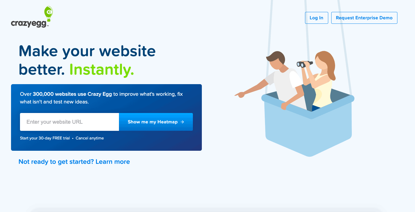
Apart from user surveys or tracking analyses with tools such as Google Analytics, an A/B test is particularly suitable. In an A/B test you can easily split the traffic of the landing page and direct it to two (or more) variants. Afterwards, the performance of the variants can be compared. For this purpose a software like e.g. CrazyEgg, Optimizely or AB tests can be useful.
I can also recommend a so-called “heat map”. It shows you which area of your website users pay the most attention to or what they click on most often. So you can easily analyse which information is effective and which is not. The colours show you the user activity for the different areas – where red generally shows the strongest activity and blue the lowest.
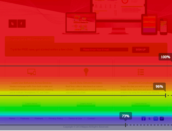
At Crazyegg you can simply enter the URL of the respective webpage to receive an evaluation. A free test version is available.
Creating a landing page: The best tools
Falls Sie noch nie eine Landingpage erstellt haben, kann es eine durchaus langwierige Angelegenheit werden. Aber nicht die Flinte ins Korn werfen! Mittlerweile gibt es zahlreiche Tools, die Sie dabei unterstützen, Landingpages ratzfatz zu kreieren. Hier einige bekannte und empfehlenswerte Programme:
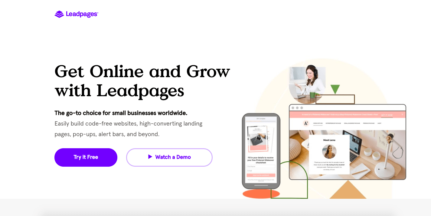
Leadpages offers a variety of templates, which are also easy to use thanks to drag & drop functions. At the same time, the final result can be easily analyzed with A/B tests. The software is available from as little as $25/month, with only the premium version also offering functions such as A/B Testing. But then with unlimited page views.
A feature-rich landing page editor that displays personalized content, CTAs and forms for individual visitors to enhance landing page performance. In addition, there is a dashbord that provides an overview of the landing pages with the highest conversion rates.
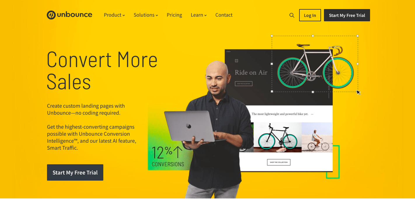
The classic among the landing page software! It features extreme usability with drag & drop functions, 100+ templates, mobile optimization and analysis tools like A/B Testing. Even without any previous knowledge, impressive landing pages can be created here. Unbounce also offers different price packages starting at $80/month – and despite its fantastic features, it is even one of the cheaper options.
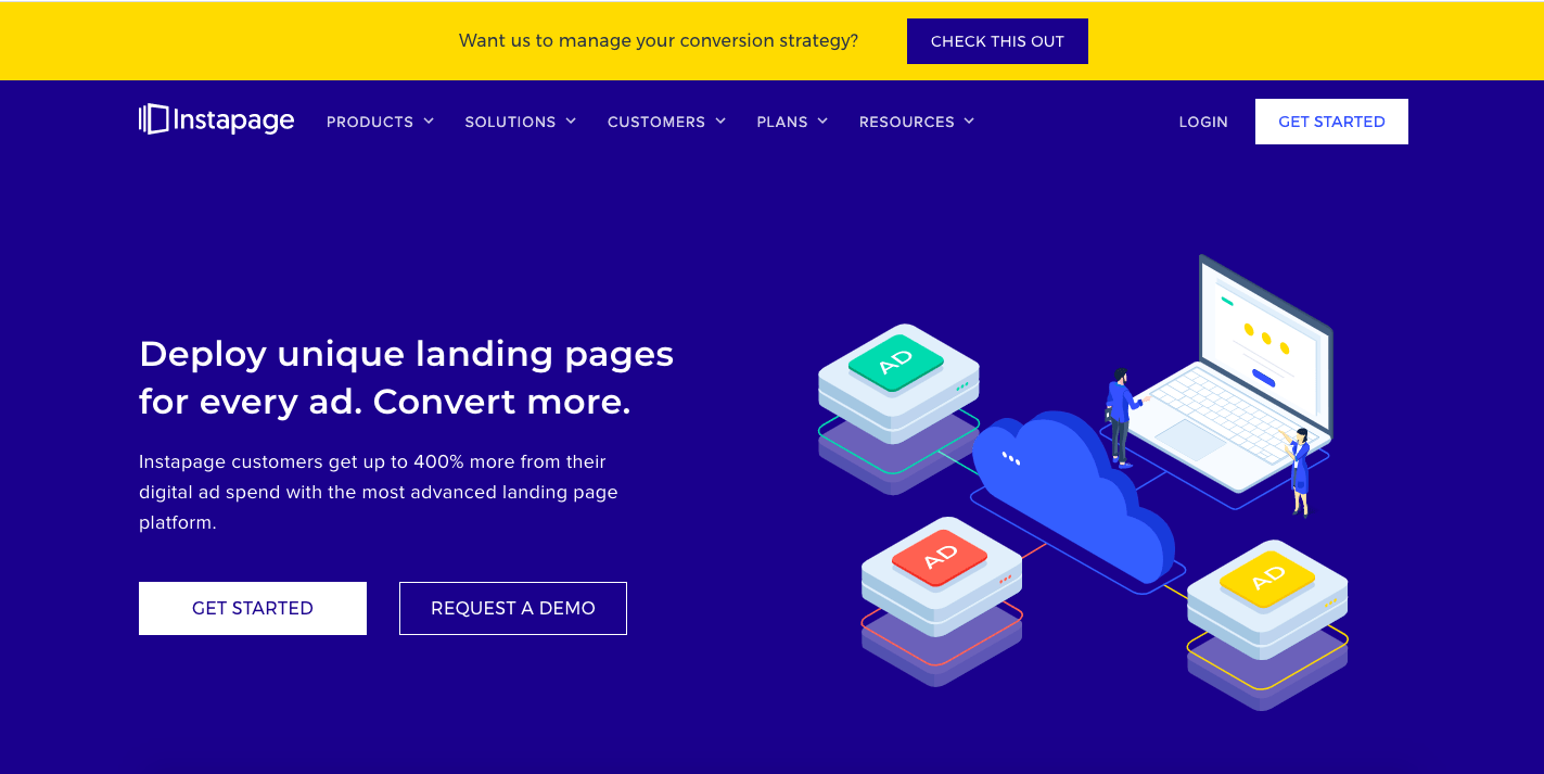
The software is relatively similar to Unbounce – easy handling, drag & drop functions and even over 200 templates characterize Instapage.
The landing pages can also be delivered for WordPress on your own domain with the help of a plugin. In addition, Instapage can be connected to a variety of Web Services. With $149/ month the tool is much more expensive than Unbounce though.
Conclusion: Create an effective landing page
A landing page is a very promising marketing element to generate more leads and “boost” conversions. However, in order for the landing page to reach its full potential, you should not do without some elements. The most important thing is that you can catch the attention of the users in the shortest possible time and integrate a clear “call-to-action”. And with the help of tools, professional and appealing landing pages can be created in no time at all.
You are still not quite sure whether a landing page is really worthwhile? Then take a look at our previous blog post. There we explain why a landing page is so effective.